Design Aesthetic Integration Across RTW & Performance
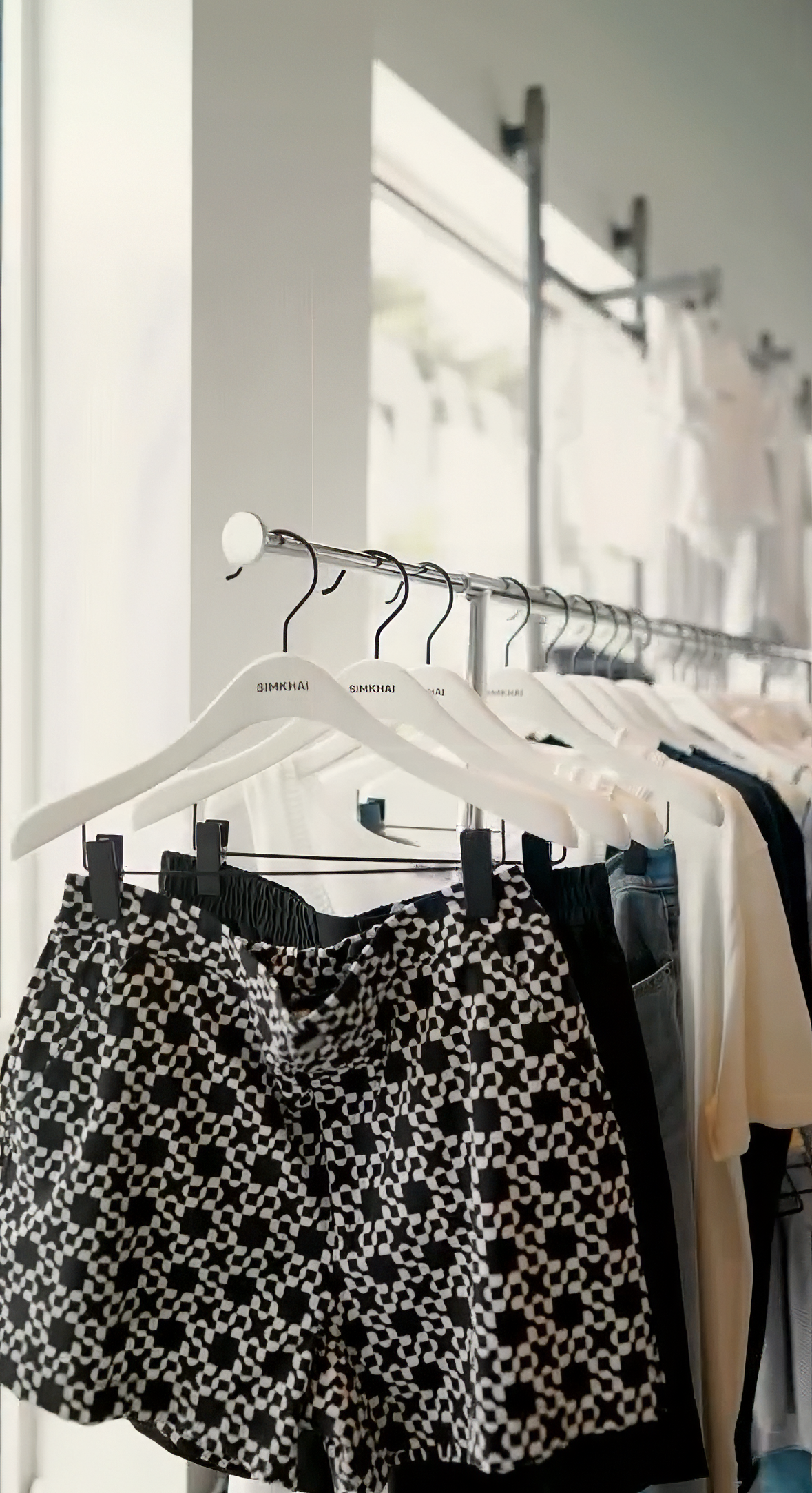
Johnathan Simkhai x Barry’s
Jonathan Simkhai partnered with Barry’s to develop a capsule that brought together two distinct design languages: the refined, ready-to-wear sensibility of a fashion house and the high-energy performance culture of a fitness brand.
The opportunity was not simply to create activewear, but to translate aesthetic values across contexts — ensuring the collection felt authentic to both brands while functioning seamlessly in the studio environment.
The work centered on identifying where the brands’ visual languages could intersect.
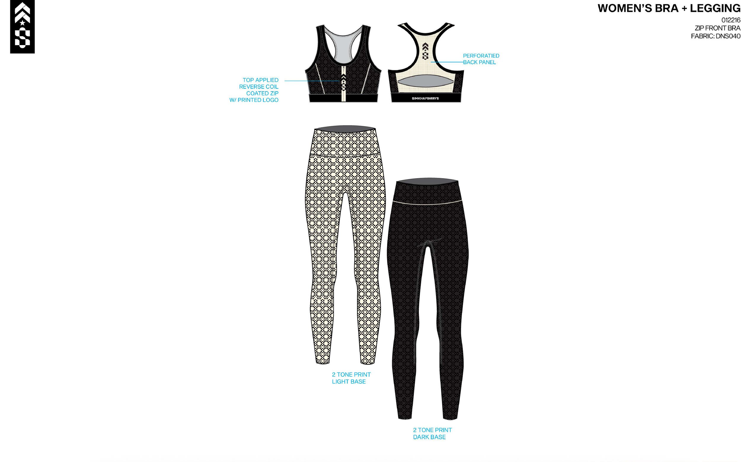
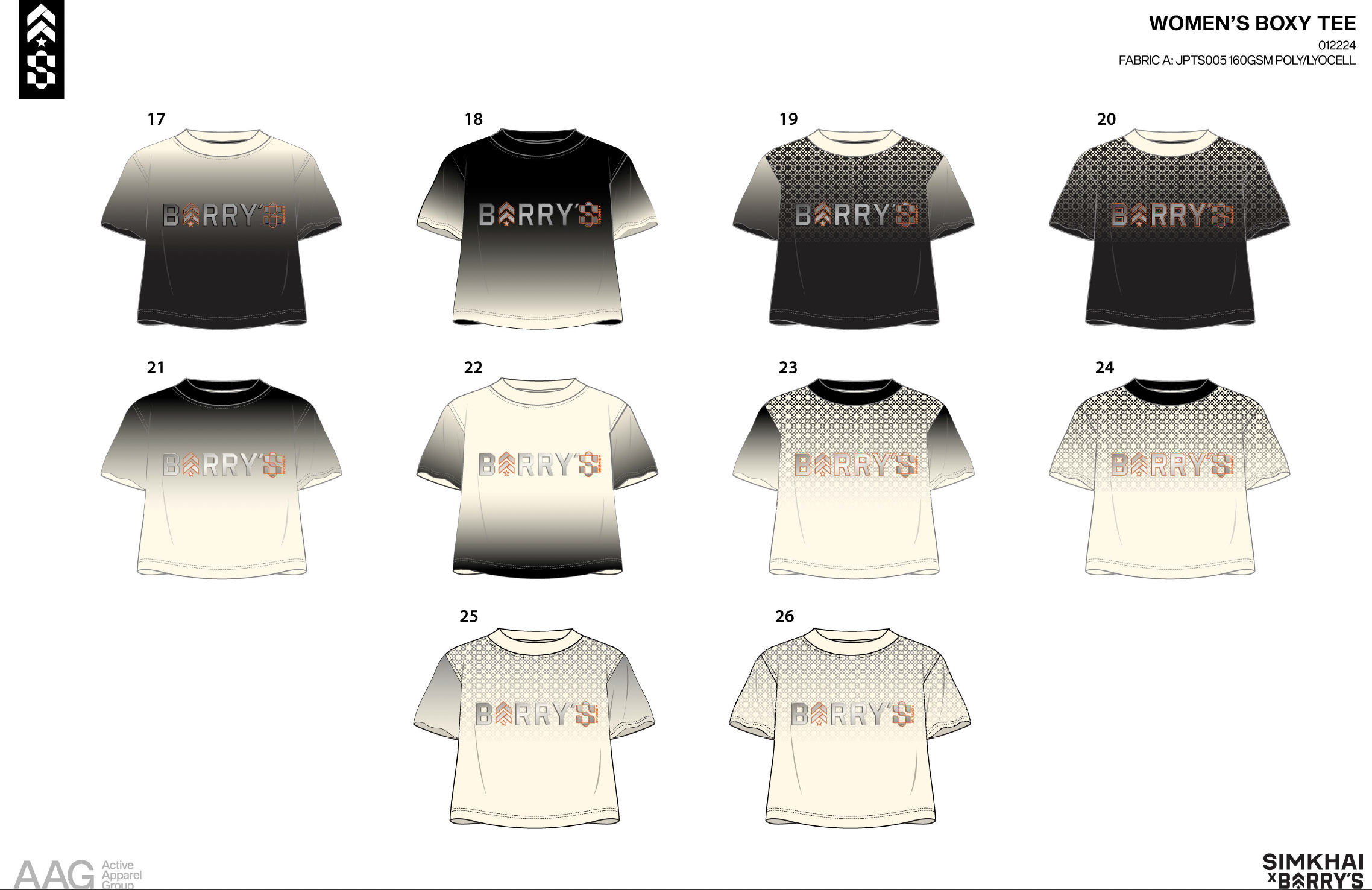
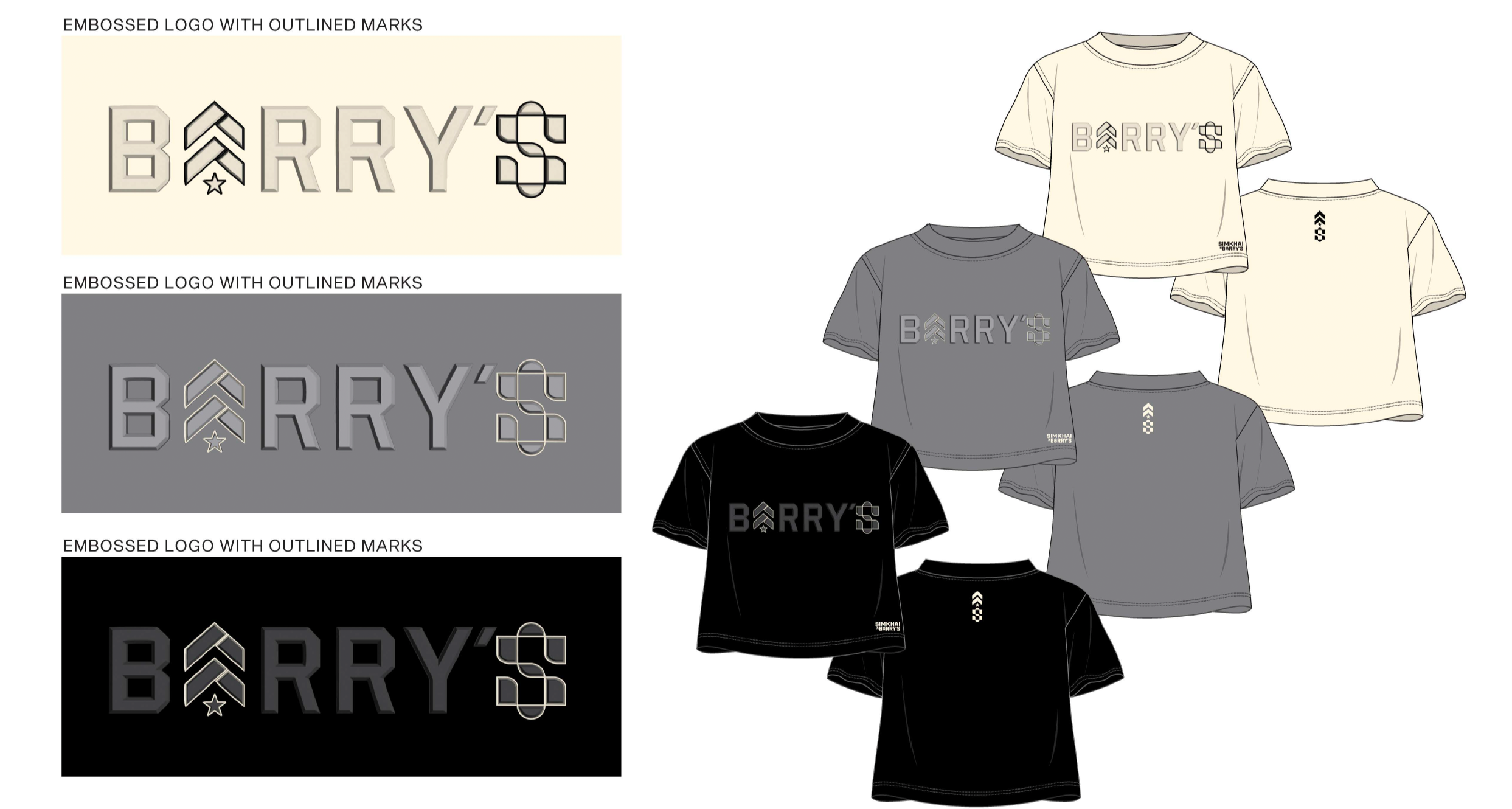
Simkhai’s emphasis on structure and subtle detail informed pattern systems that felt considered and refined, while Barry’s energy guided scale, contrast, and graphic clarity. The goal was to create surfaces that felt elevated yet dynamic, capable of performing under movement and studio lighting.
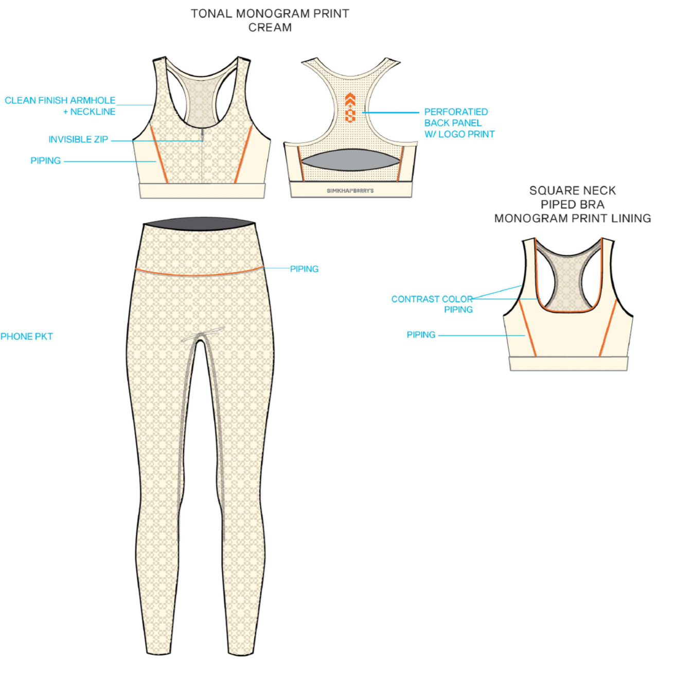
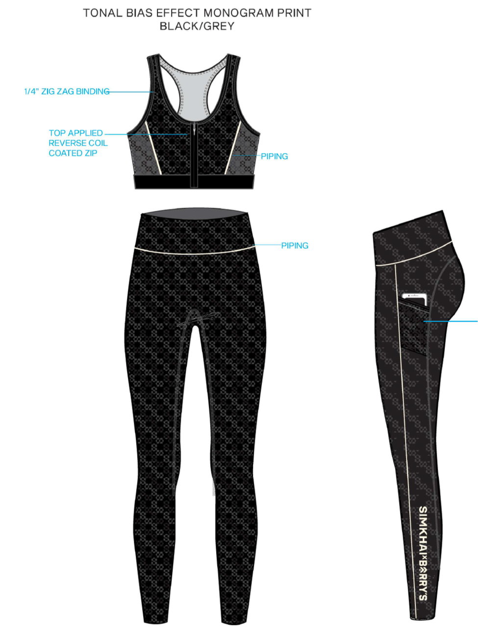
I focused on rhythm, proportion, and tonal balance so prints would support form rather than compete with it, allowing garments to feel intentional across both fashion and performance contexts.
The process required careful consideration of both aesthetic intent and technical realities, ensuring prints translated effectively through production while preserving clarity.
Execution
I contributed across:
• Development of tonal monogram systems
• Creation of repeat prints that balanced refinement and energy
• Graphic logo exploration and integration
• Placement strategy across bras, leggings, and tees
• Alignment of visual language across the capsule
The collection established a cohesive visual dialogue between ready-to-wear and performance, allowing each brand’s identity to remain legible while creating a unified expression.
The crossover demonstrated how thoughtful surface language can bridge disciplines, supporting products that feel both elevated and functional.
Reflection
This project reinforced the value of translating design sensibilities across environments — recognizing where visual language can adapt while maintaining integrity.
It remains an example of how careful attention to surface and graphics can support collaborations that feel intentional rather than stylistic overlays.