Sustaining Cohesive Visual Language within a Heritage Brand
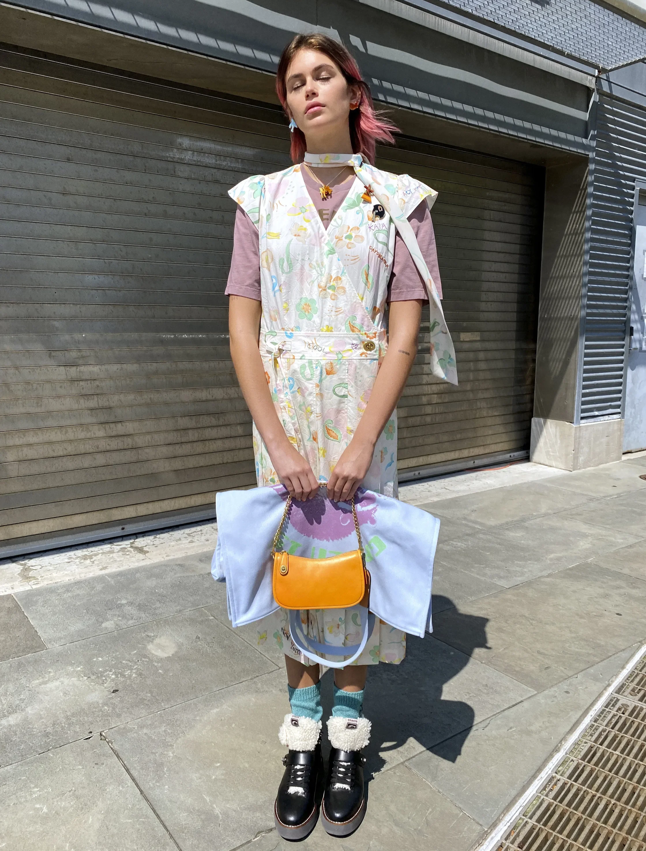
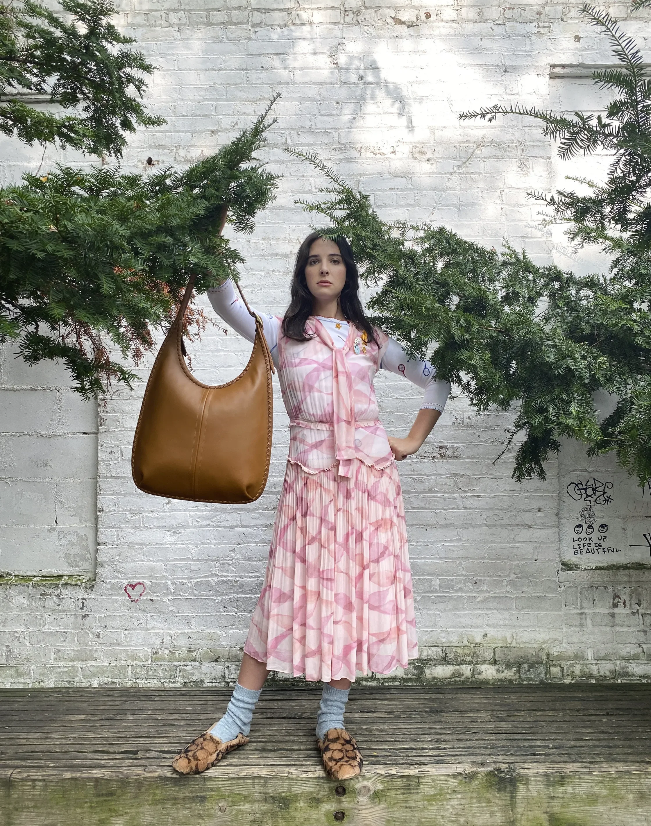
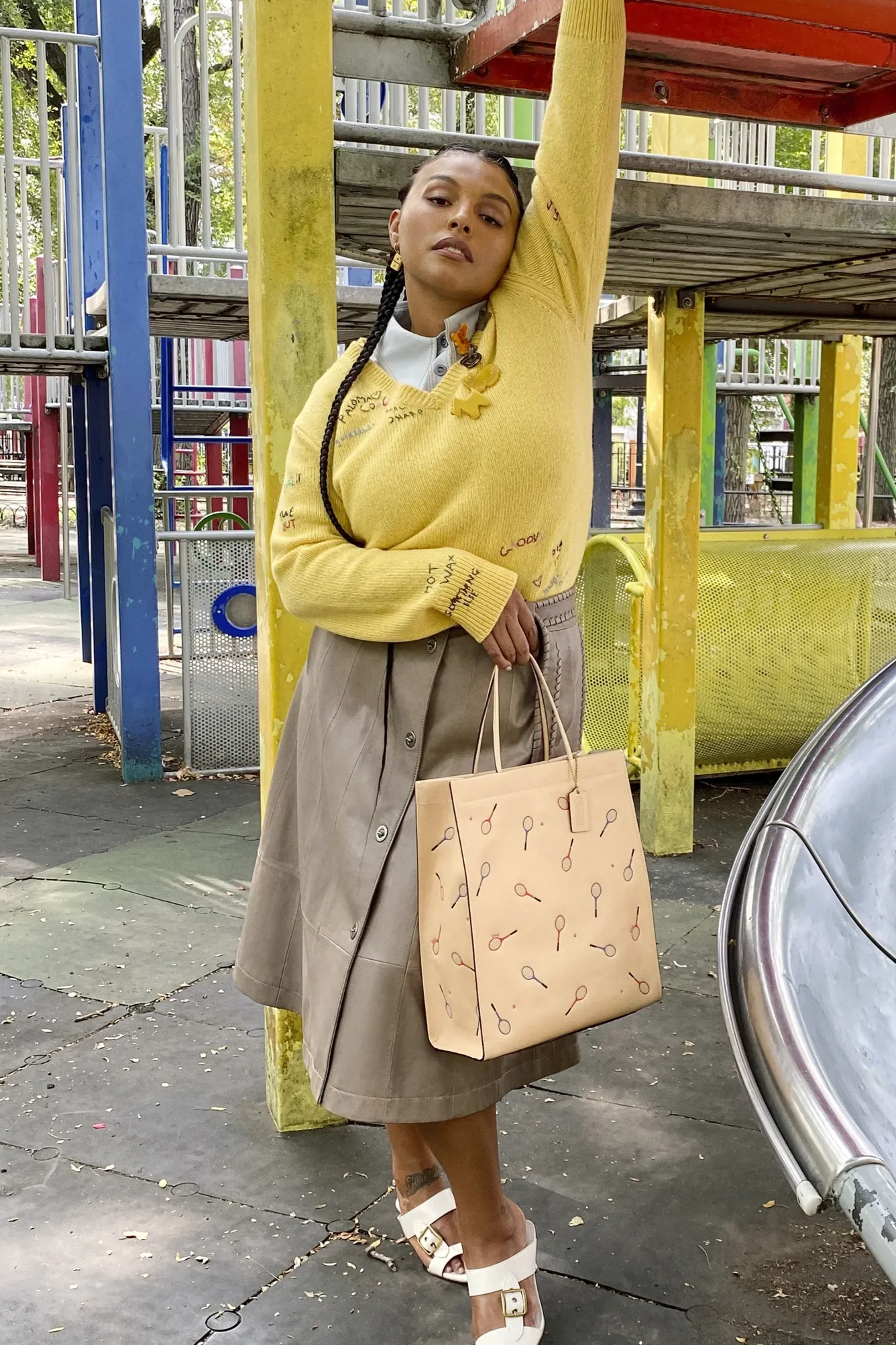
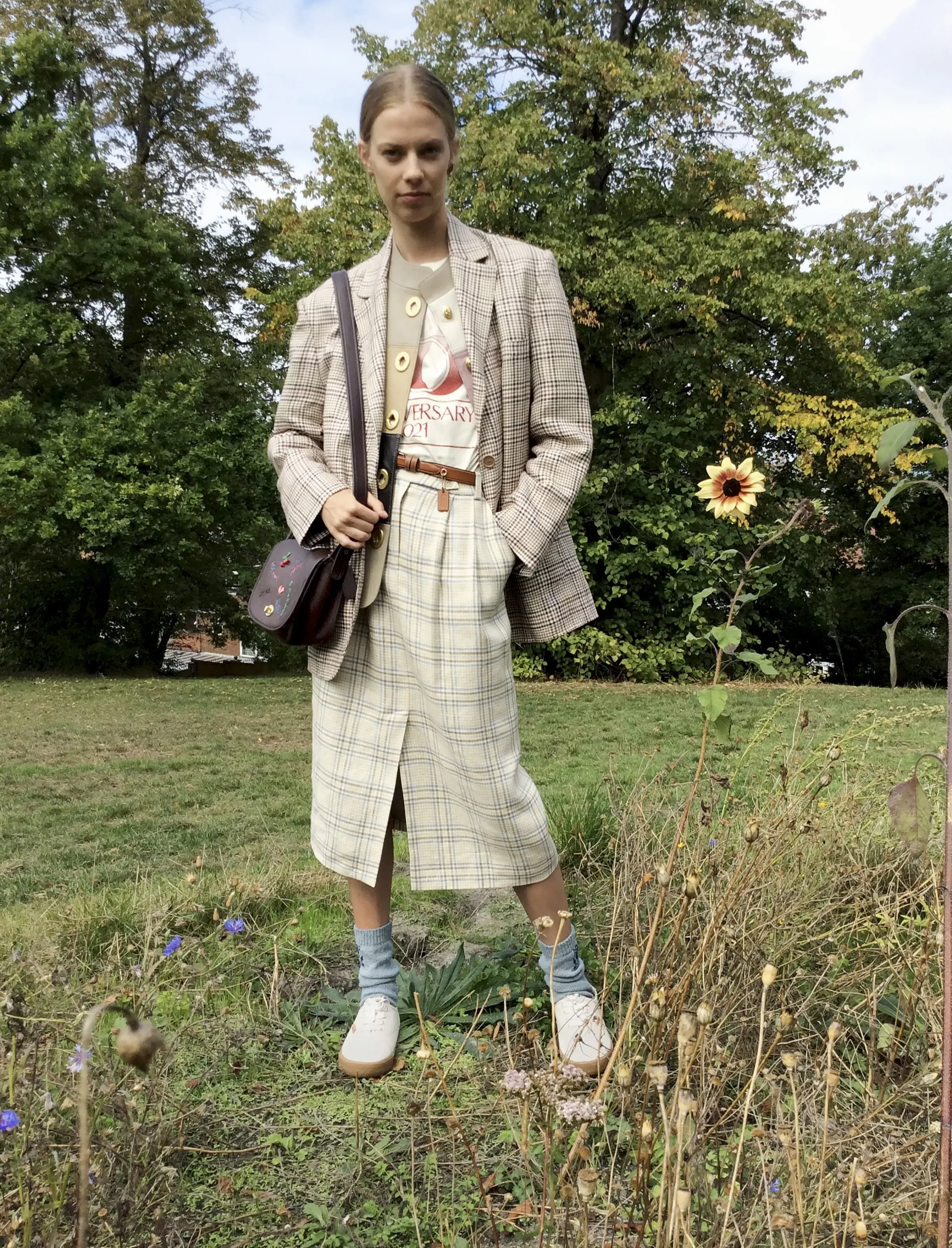
Coach RTW 2021 Collection
Working within Coach’s design environment meant contributing to a brand with a deeply established visual identity and strong cultural presence. The opportunity was to support seasonal development while ensuring that graphics, prints, and surface expressions reinforced a coherent point of view across categories.
With multiple collections and narratives unfolding simultaneously, maintaining continuity was essential so that individual pieces felt connected to the broader brand language.
The goal was to reinforce a sense of continuity while allowing space for seasonal evolution.
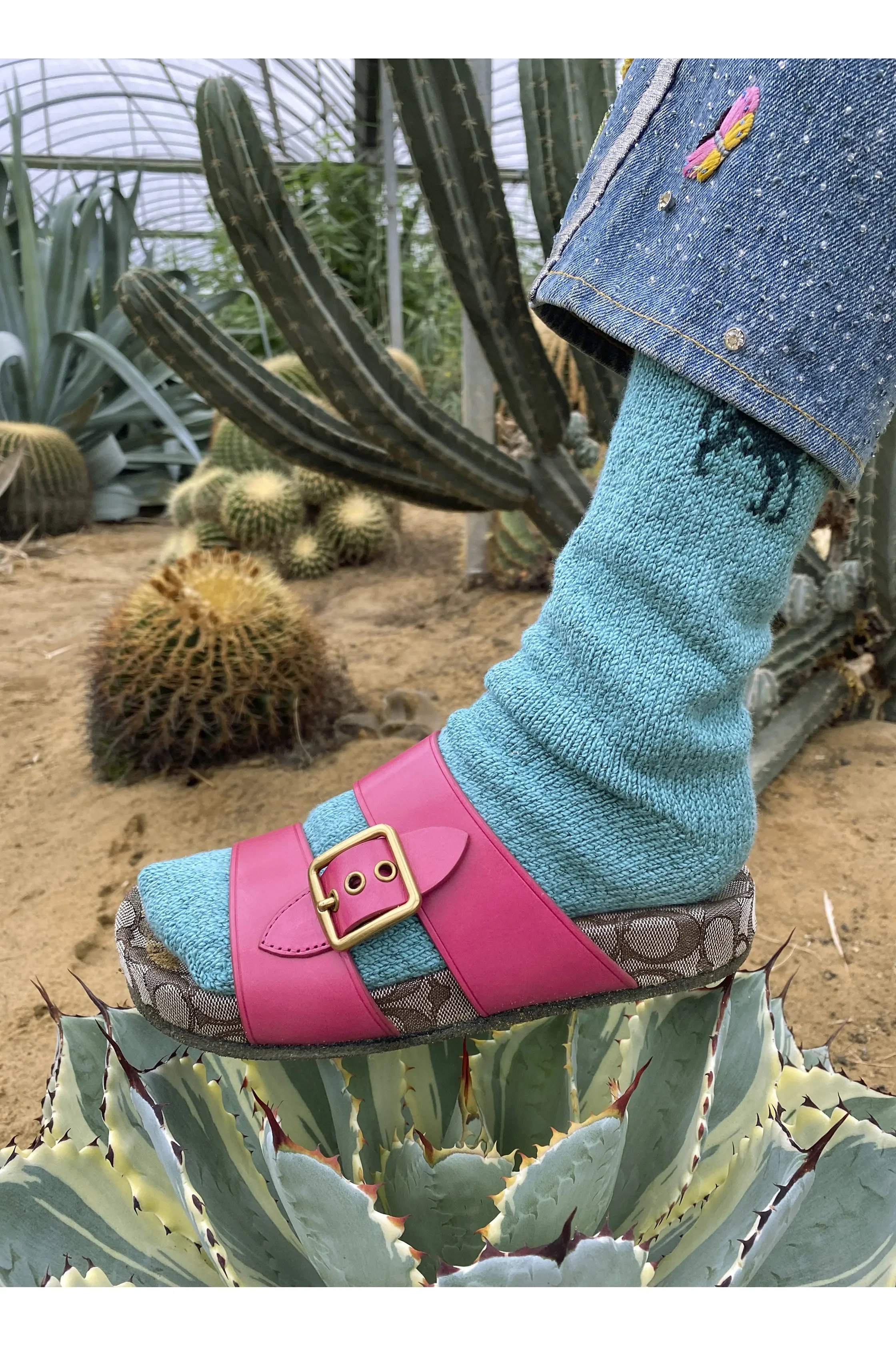
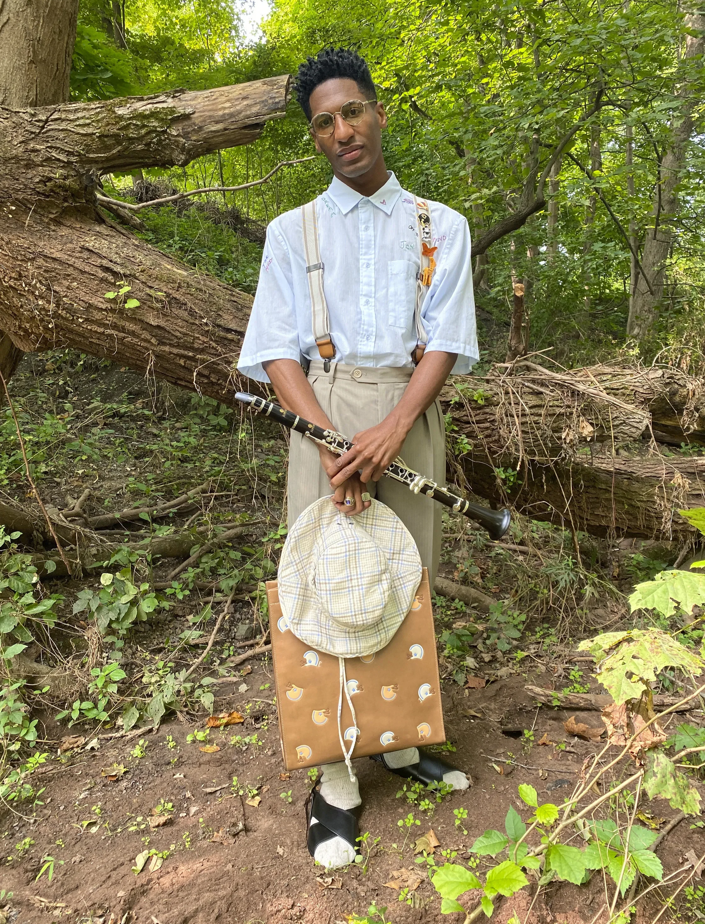
I supported cohesive visual language through the development of graphics, prints, and surface applications across apparel and accessories, contributing to how seasonal stories translated into product.

Working closely with design teams, I helped refine visual elements so they aligned with Coach’s heritage while responding to evolving creative direction.
Execution
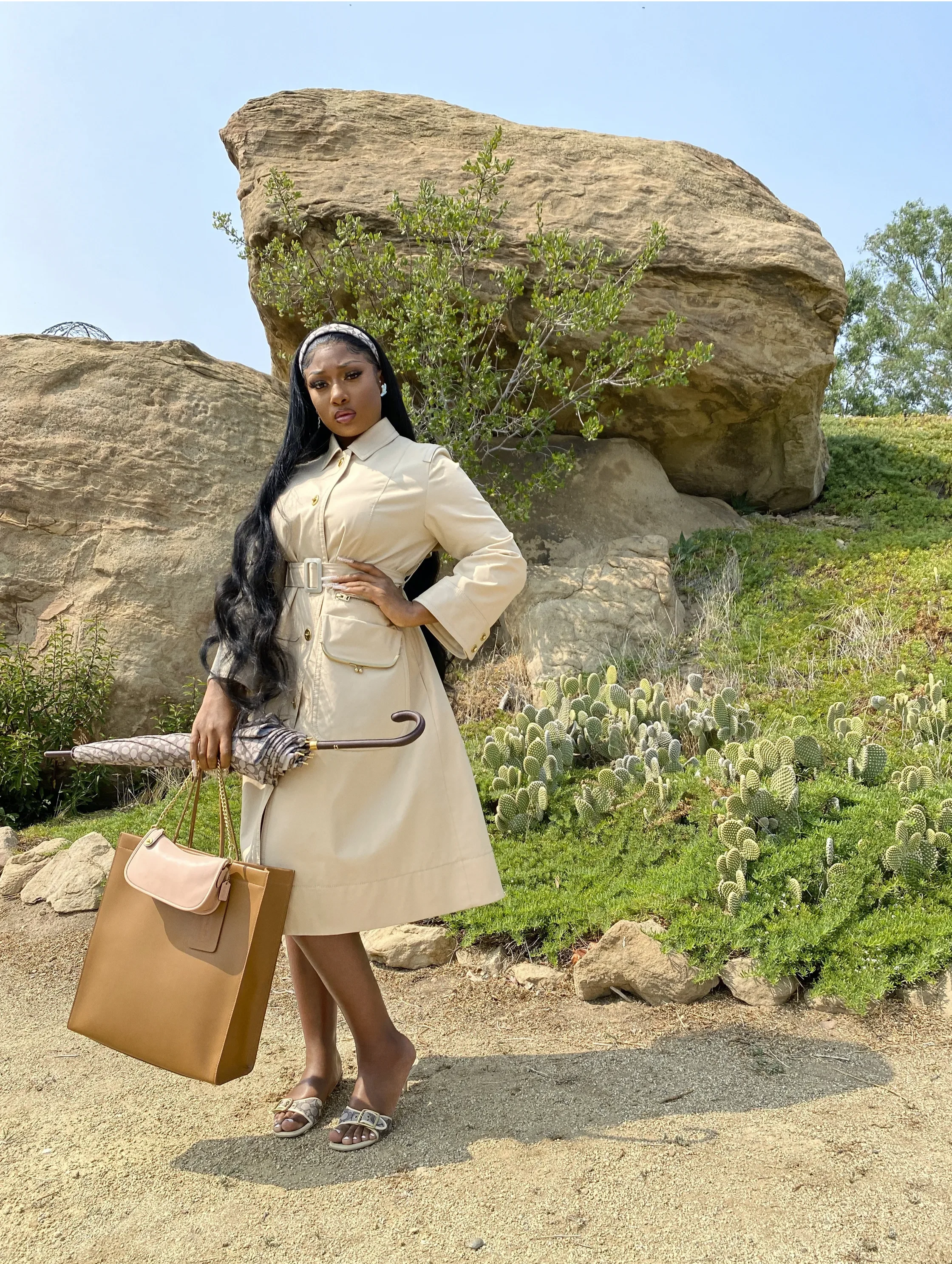
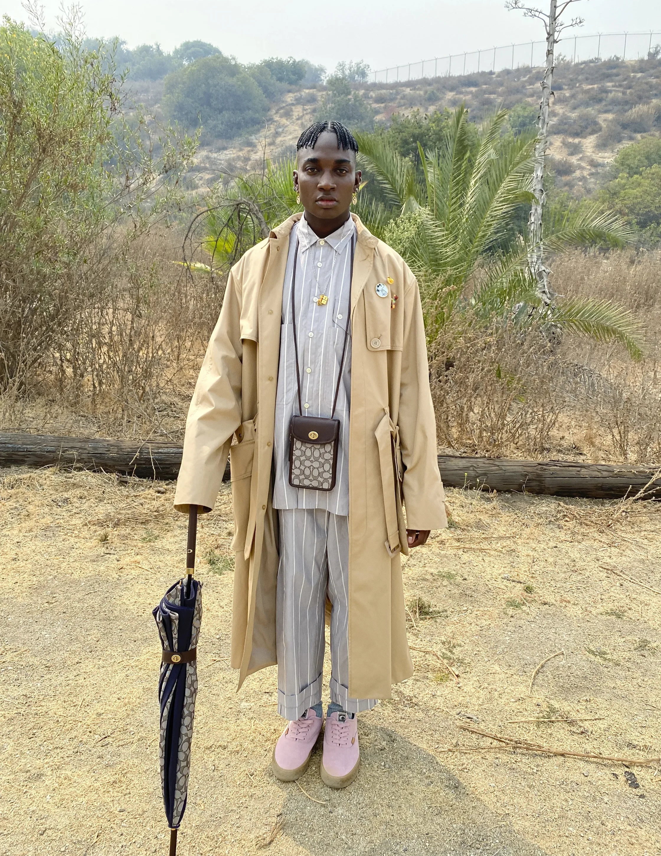
The work centered on understanding how Coach’s identity expresses itself through subtle cues — proportion, color relationships, motif usage, and the balance between playfulness and polish.
I contributed across:
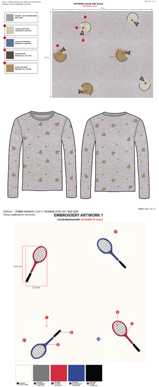
• Graphic development for apparel and product storytelling
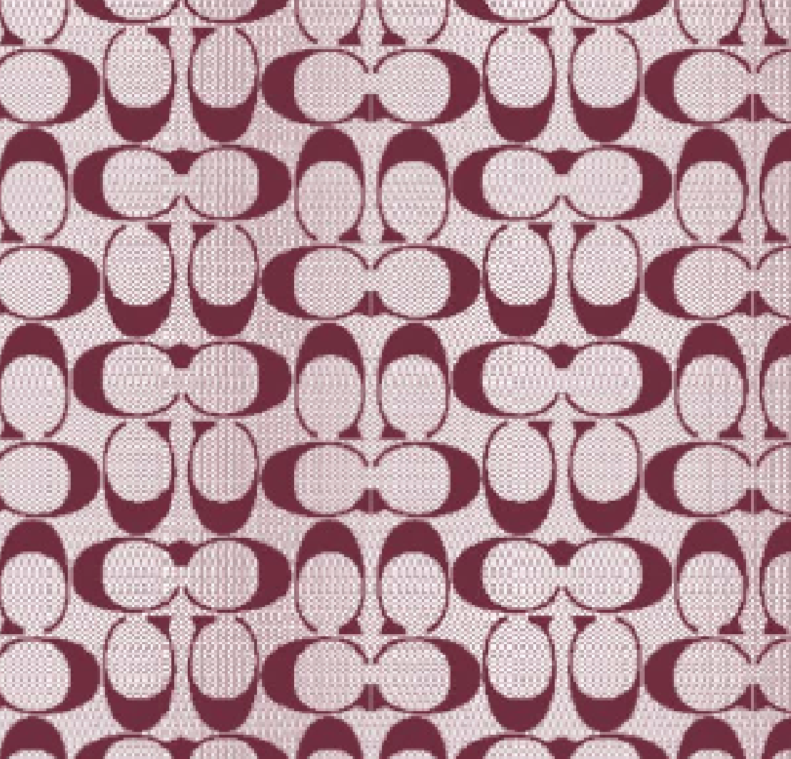
• Print and motif exploration aligned with seasonal direction
• Logo and icon refinement
• Color and placement considerations to maintain consistency
• Cross-category alignment to ensure visual coherence
Outcome
The collections maintained a cohesive visual language across garments and accessories, reinforcing the brand’s identity while allowing seasonal narratives to unfold with clarity.
The work supported an environment where individual pieces felt connected to a larger story, strengthening the overall expression.

It remains an example of how thoughtful attention to graphics and surface can help sustain coherence within a heritage brand.
Reflection
This experience reinforced the importance of working within established visual systems — recognizing when to contribute, when to refine, and how to support continuity without disruption.
Reflection
This experience reinforced the importance of working within established visual systems — recognizing when to contribute, when to refine, and how to support continuity without disruption.
It remains an example of how thoughtful attention to graphics and surface can help sustain coherence within a heritage brand.