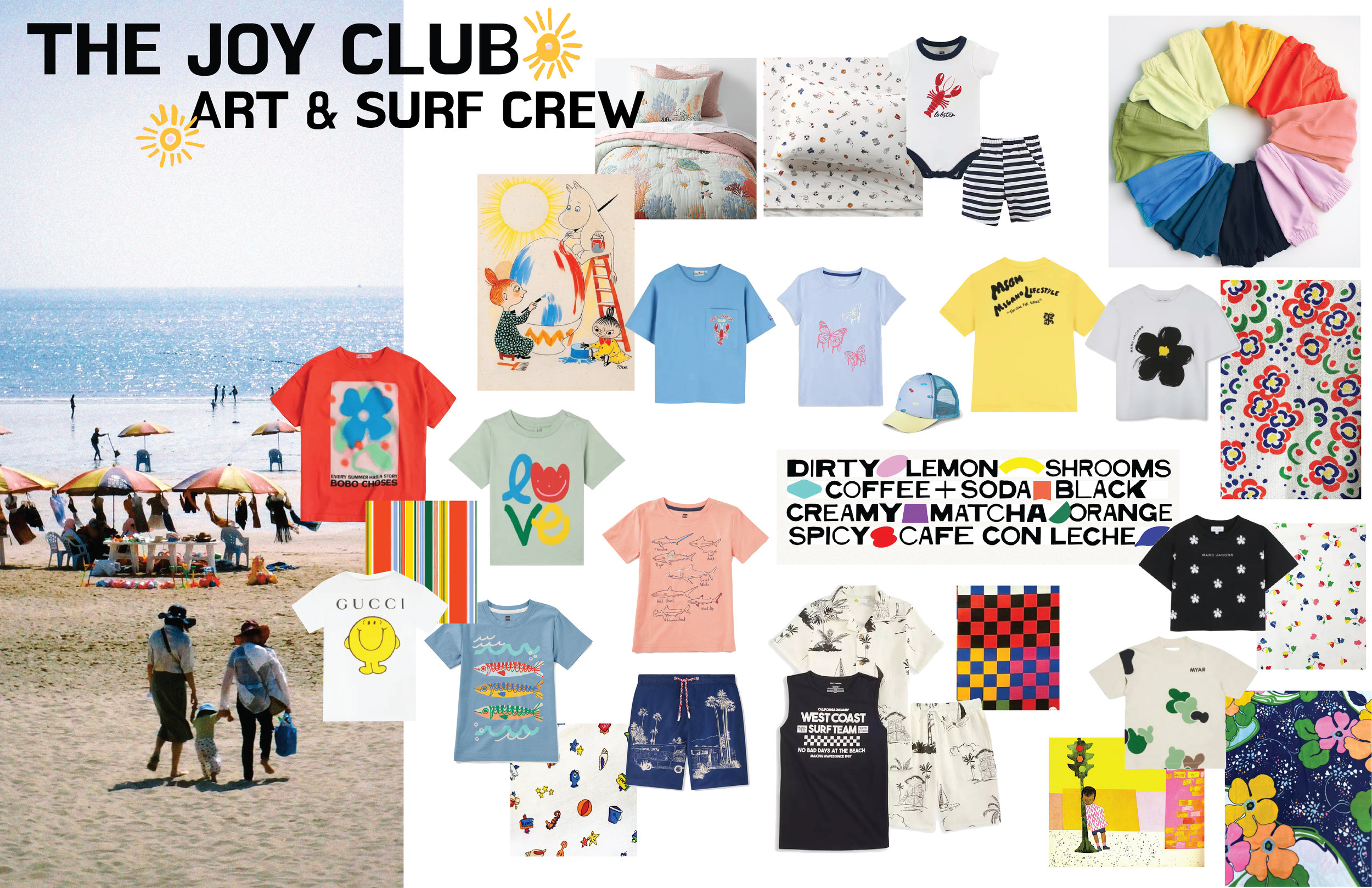
The Joy Club
Art & Surf Crew
A Summer Print & Graphic Study (Ages 2–14)
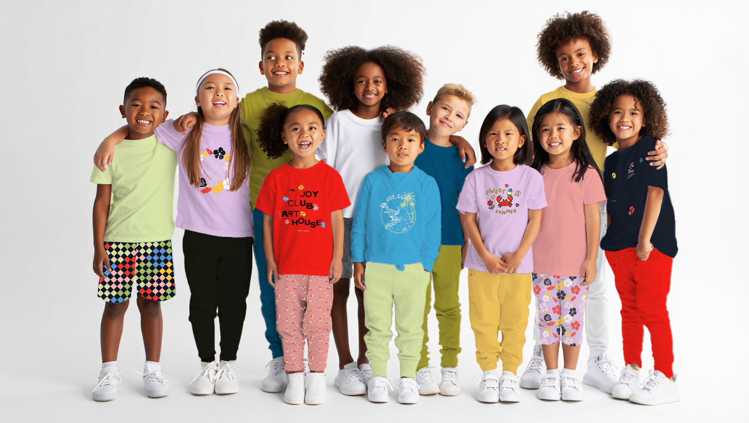
The Joy Club: Art & Surf Crew is a seasonal print and graphic study exploring optimism, creative play, and coastal energy across early childhood through youth. Designed as a unified summer capsule, the collection blends surf culture with artistic expression—balancing bright color, nostalgic references, and scalable graphic systems suitable for multi-age assortments.
Purpose of StudyThis study explores how summer can function as both setting and emotional framework. Surf represents movement and freedom; art represents individuality and expression.
Together, they create a joyful visual language adaptable across boys, girls, and unisex categories. The result is a cohesive capsule with strong merchandising flexibility, clear storytelling, and broad retail relevance.
Guiding Design
Framework
Playful clarity for strong shelf presence
Light nostalgic references for warmth
Graphic systems that encourage expression
Scalable storytelling across age groups
Color Direction
The palette balances saturated brights with nostalgic warmth—sun yellow, coral red, coastal blue, grassy green, creamy neutrals, and playful accents. Colors are designed to mix across gender and category, encouraging coordinated outfitting.
Girls: Coastal Bloom
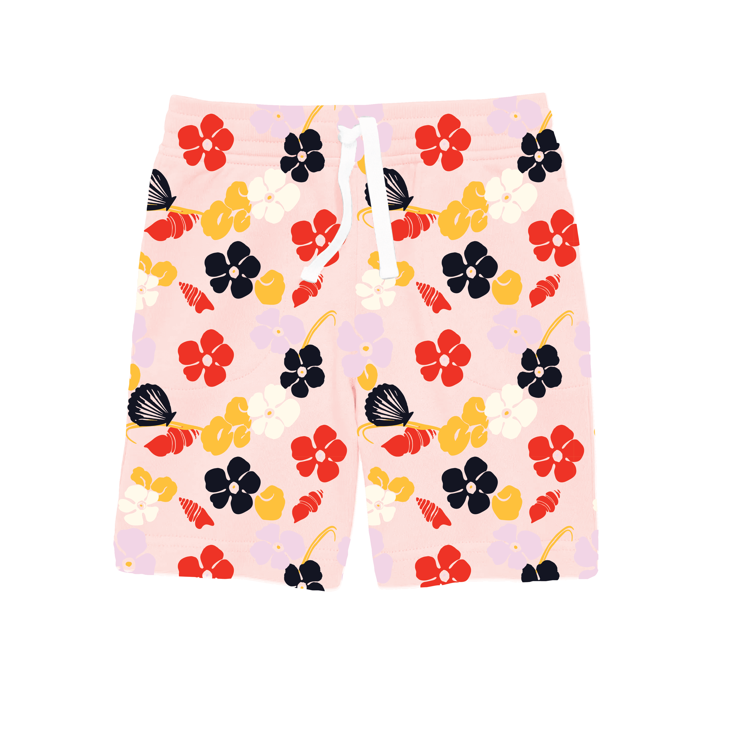
Theme: Floral Beach + Crab Motif
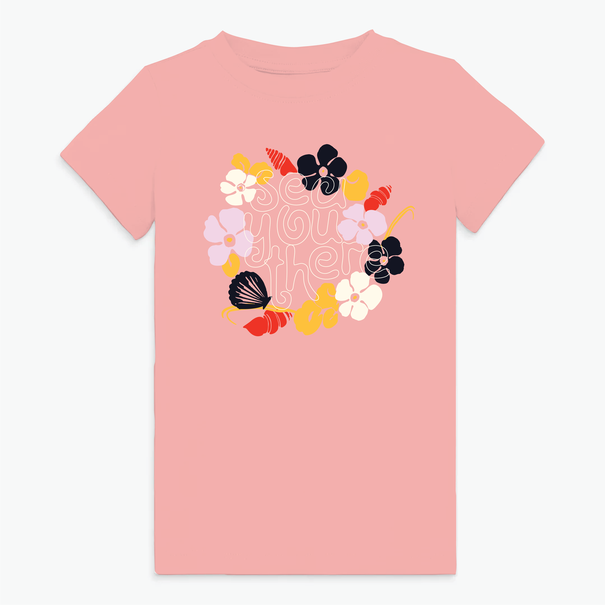
The girls’ assortment explores a playful coastal bloom narrative—blending painterly florals with seaside iconography. Bright, optimistic color meets soft nostalgic references, creating a summer story that feels expressive yet approachable.
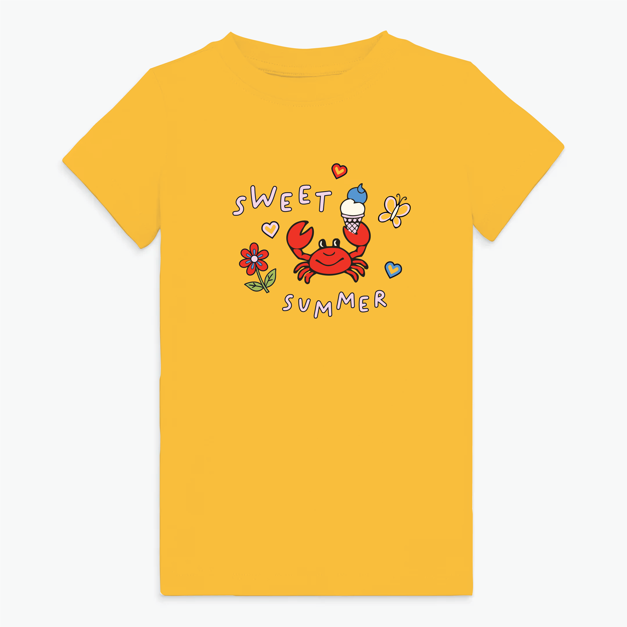
Floral graphics are rendered in bold, simplified forms for strong visual impact, while the crab motif introduces a whimsical coastal personality that anchors the capsule. The balance of organic shapes and graphic clarity allows prints to scale from small repeats to statement placements.
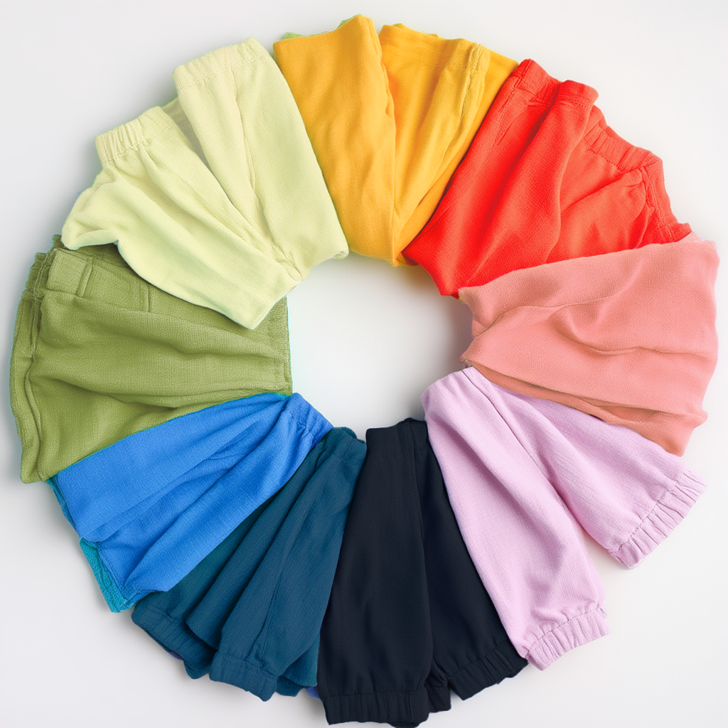
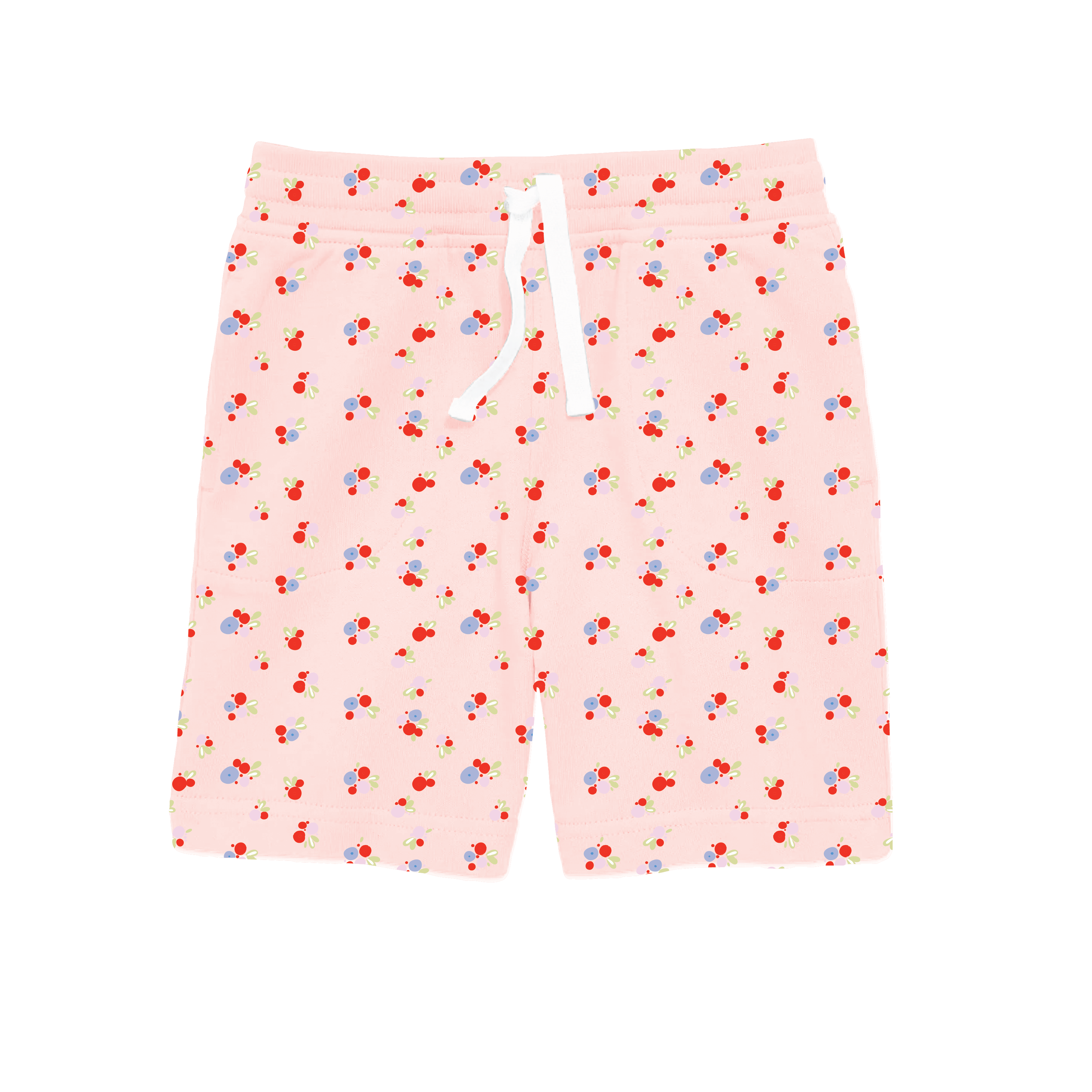
Coordinating shorts are designed to mix seamlessly across the capsule—solid brights, soft stripes, and repeat florals provide flexibility while maintaining visual cohesion.
Design Notes:
• Bold simplified florals
• Playful crustacean iconography
• Sun-washed brights with creamy balance
• Scalable placement + repeat systems
• Coordinated bottoms across categories
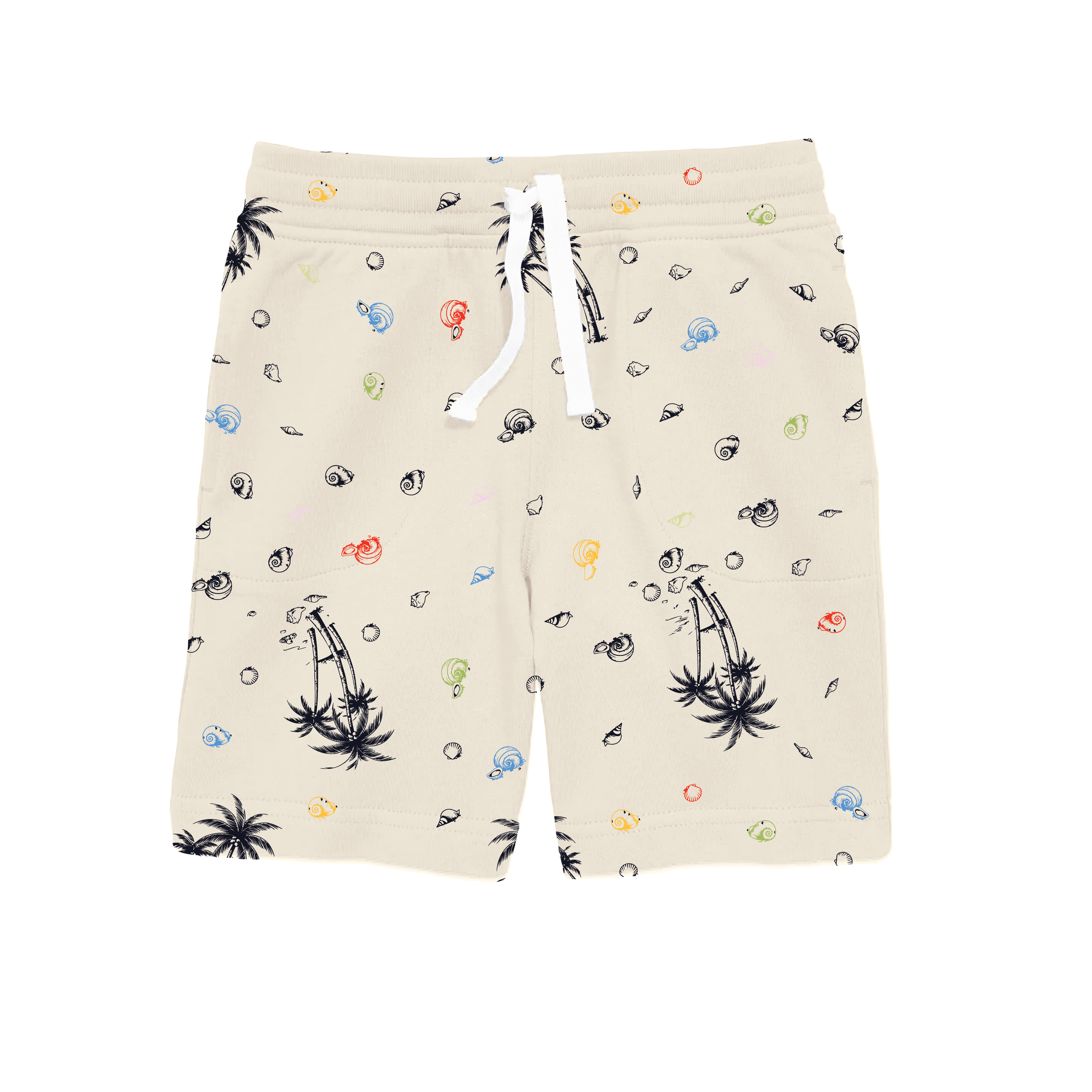
Boys: Surfing Dinosaur
Theme: Prehistoric Surf Club
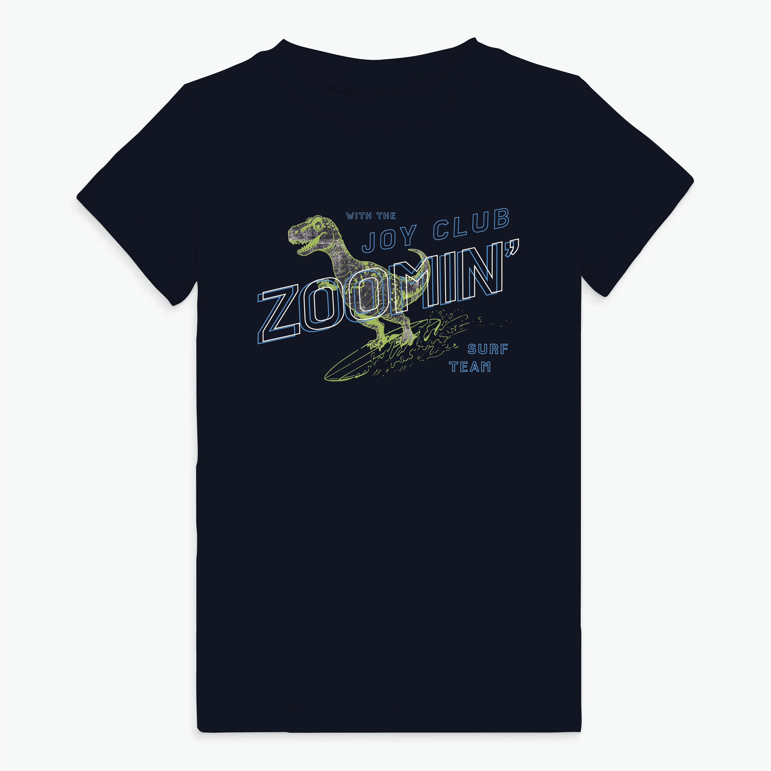
The boys’ assortment centers on a surfing dinosaur concept—merging adventure with humor and movement. The dinosaur graphic becomes both character and mascot, bridging imagination and surf culture in a way that feels age-appropriate across 2–14.
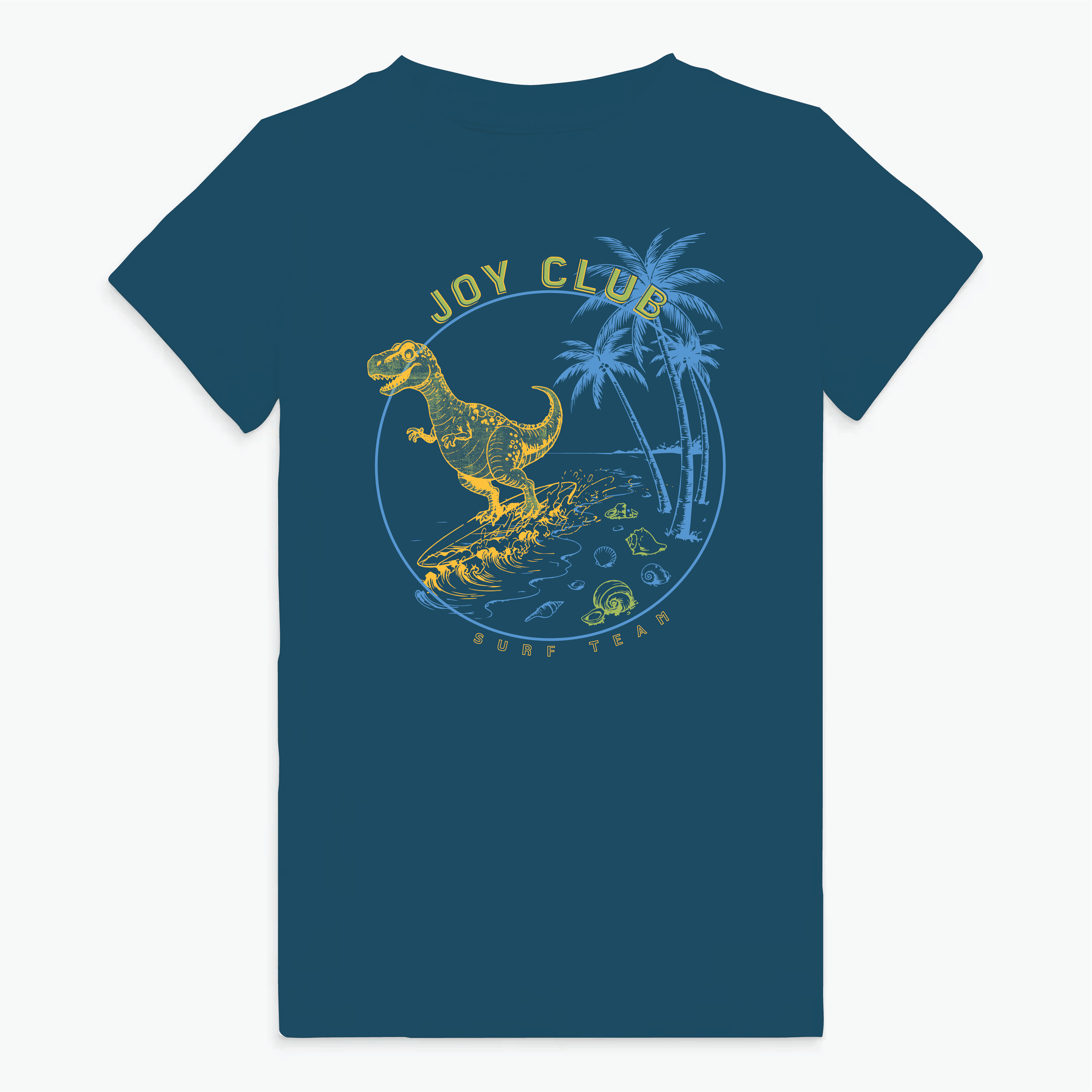
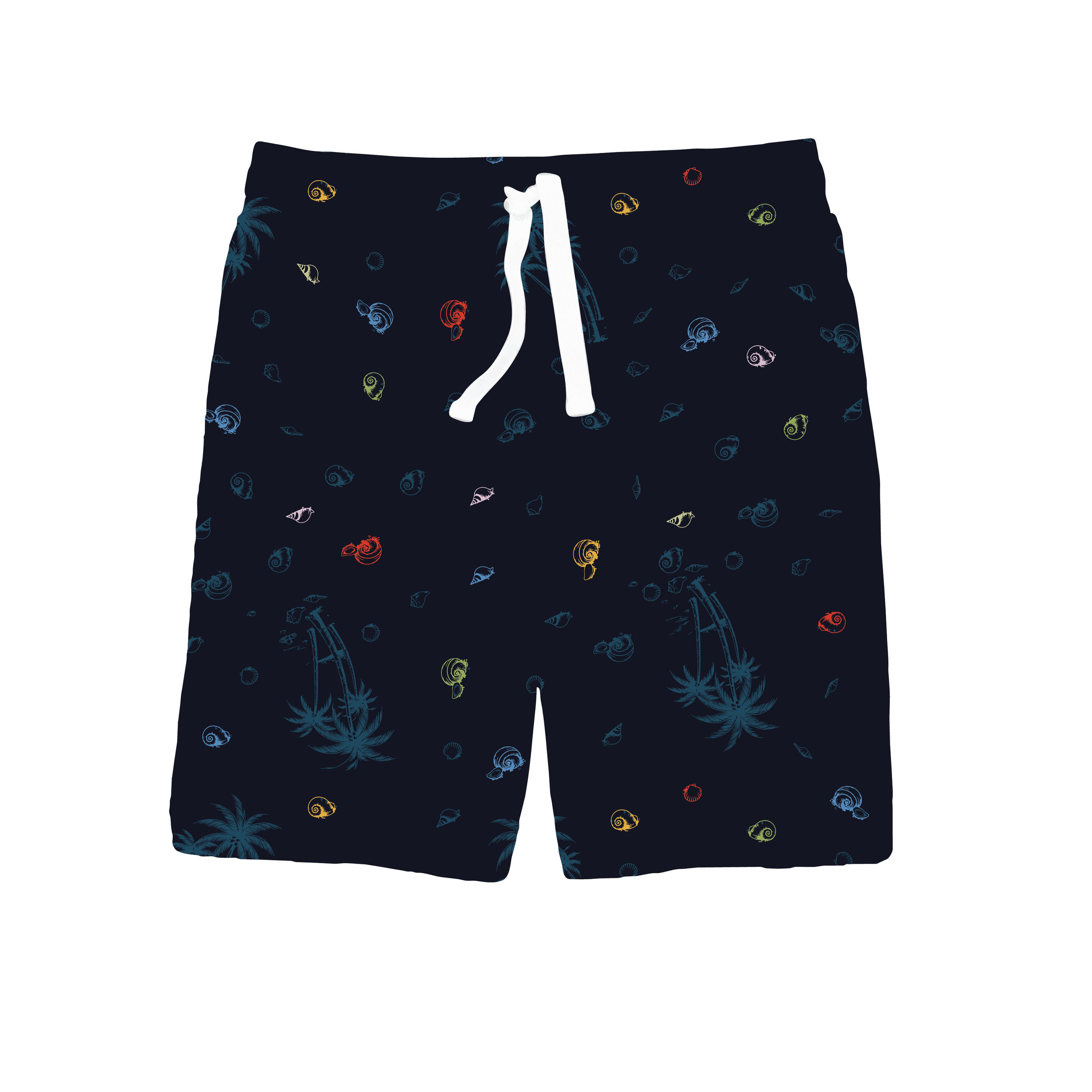
Graphics emphasize motion—wave lines, surfboards, coastal badges—while maintaining a friendly tone. Color is bright and energetic, grounded with blues, greens, and sun-washed neutrals.
Shorts coordinate across styles, supporting graphic tees with tonal solids, subtle prints, and versatile stripe options to enable mix-and-match outfitting.
Design Notes:
• Character-driven mascot
• Motion-forward linework
• Surf-inspired iconography
• Graphic stripes + tonal solids
• Age-scalable execution
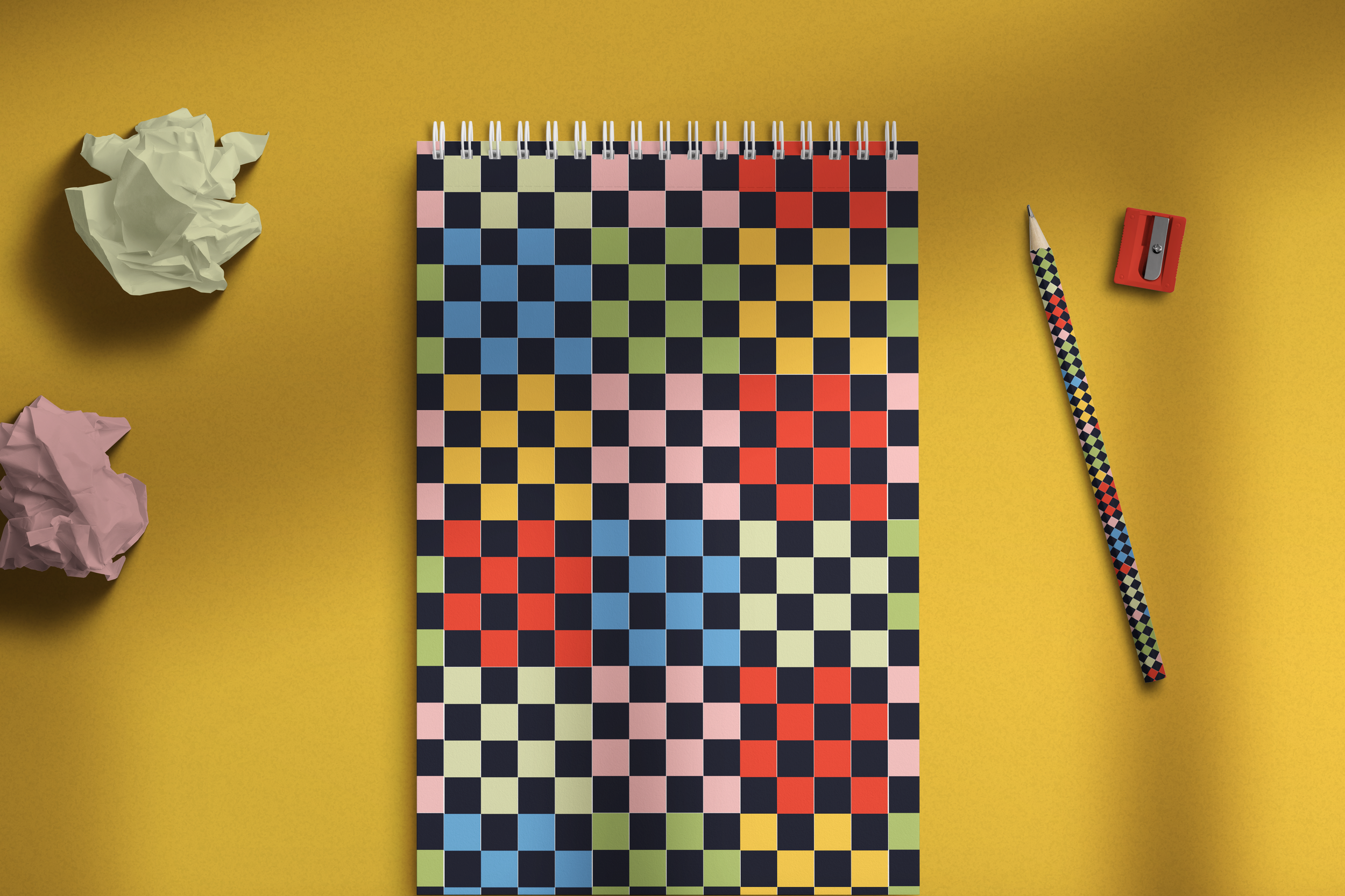
Unisex: Art House
Theme: Creative Studio Energy
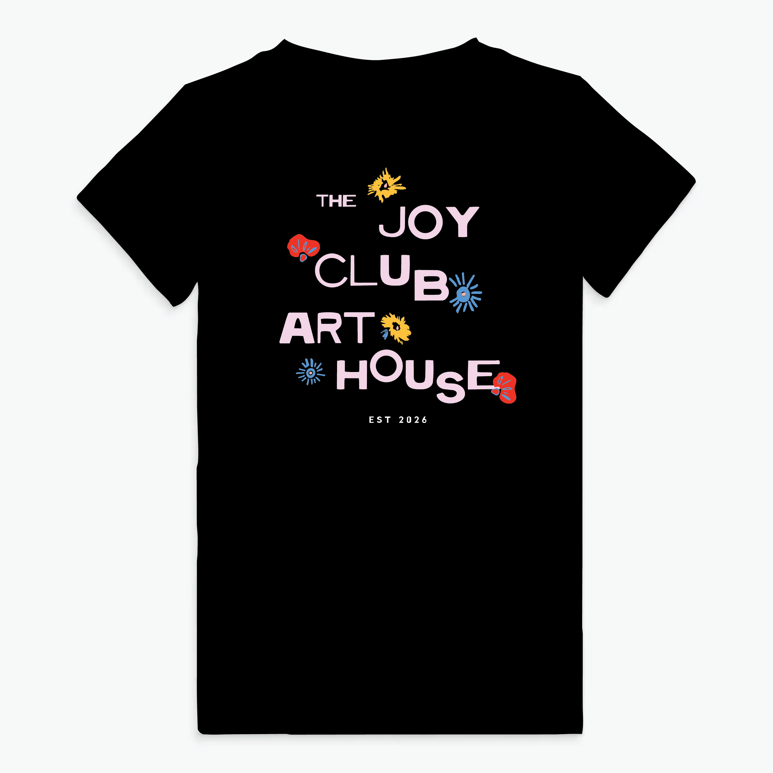
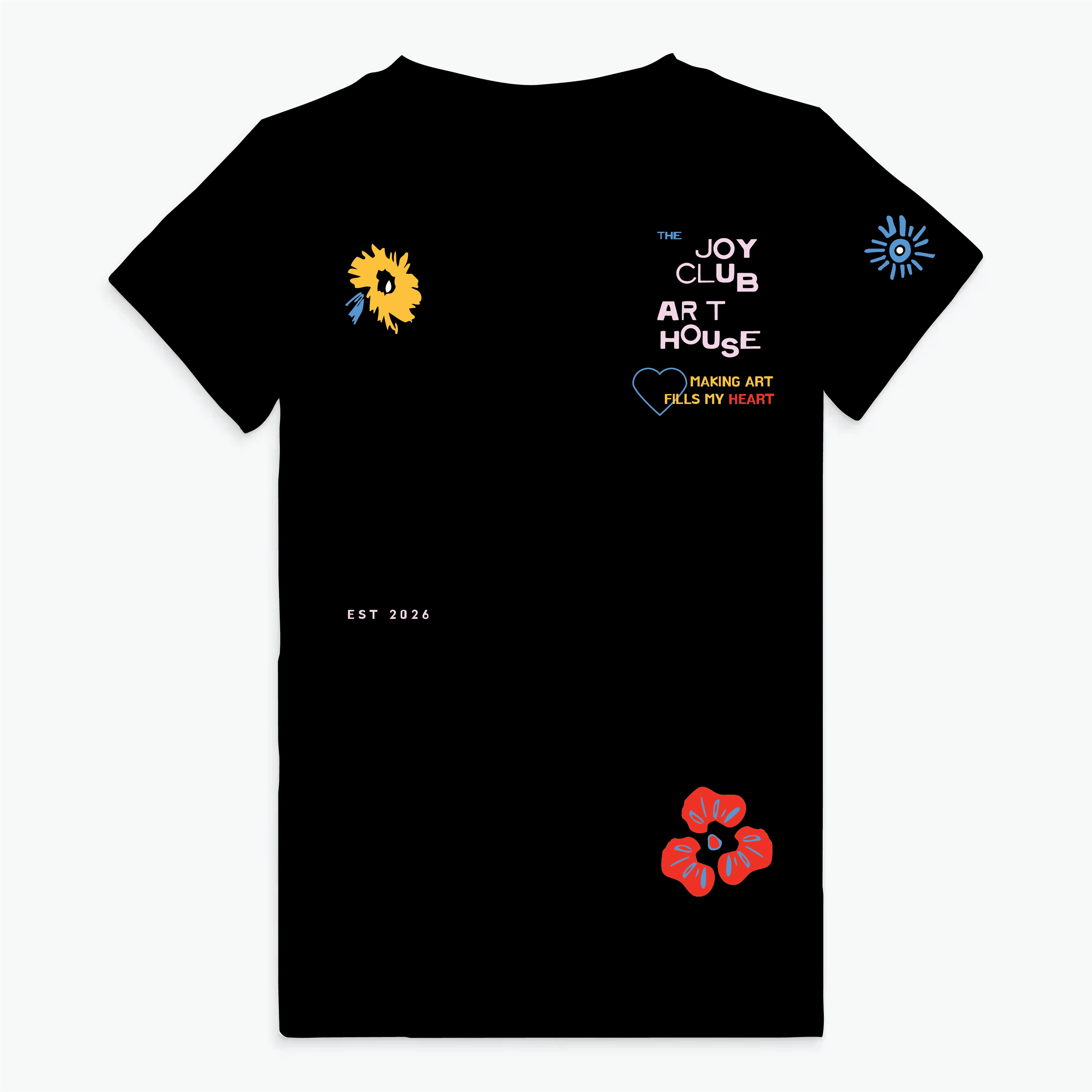
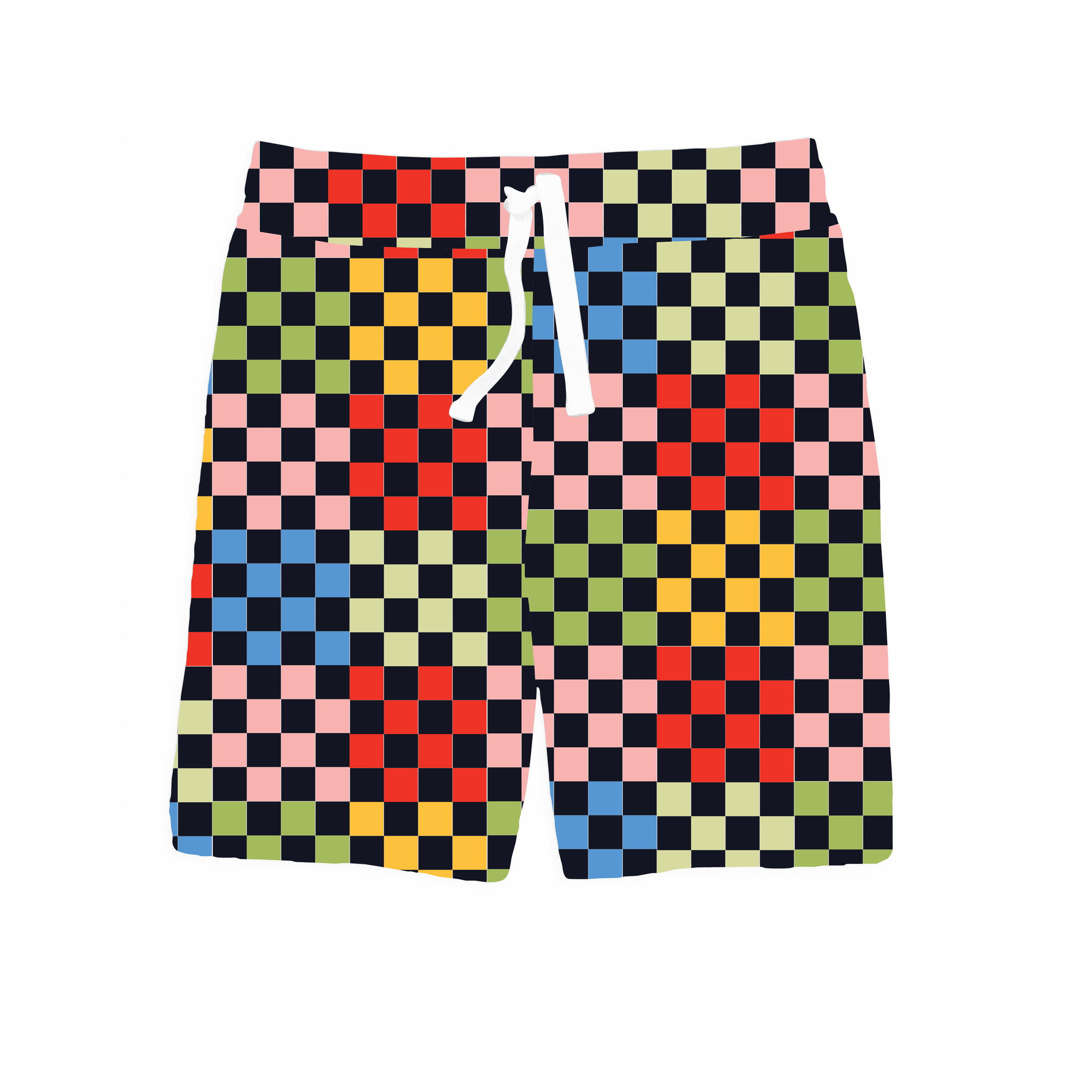
The unisex assortment explores the Art House concept—celebrating color, creativity, and expression. Graphics draw from painterly marks, abstract florals, hand-drawn typography, and playful shapes.
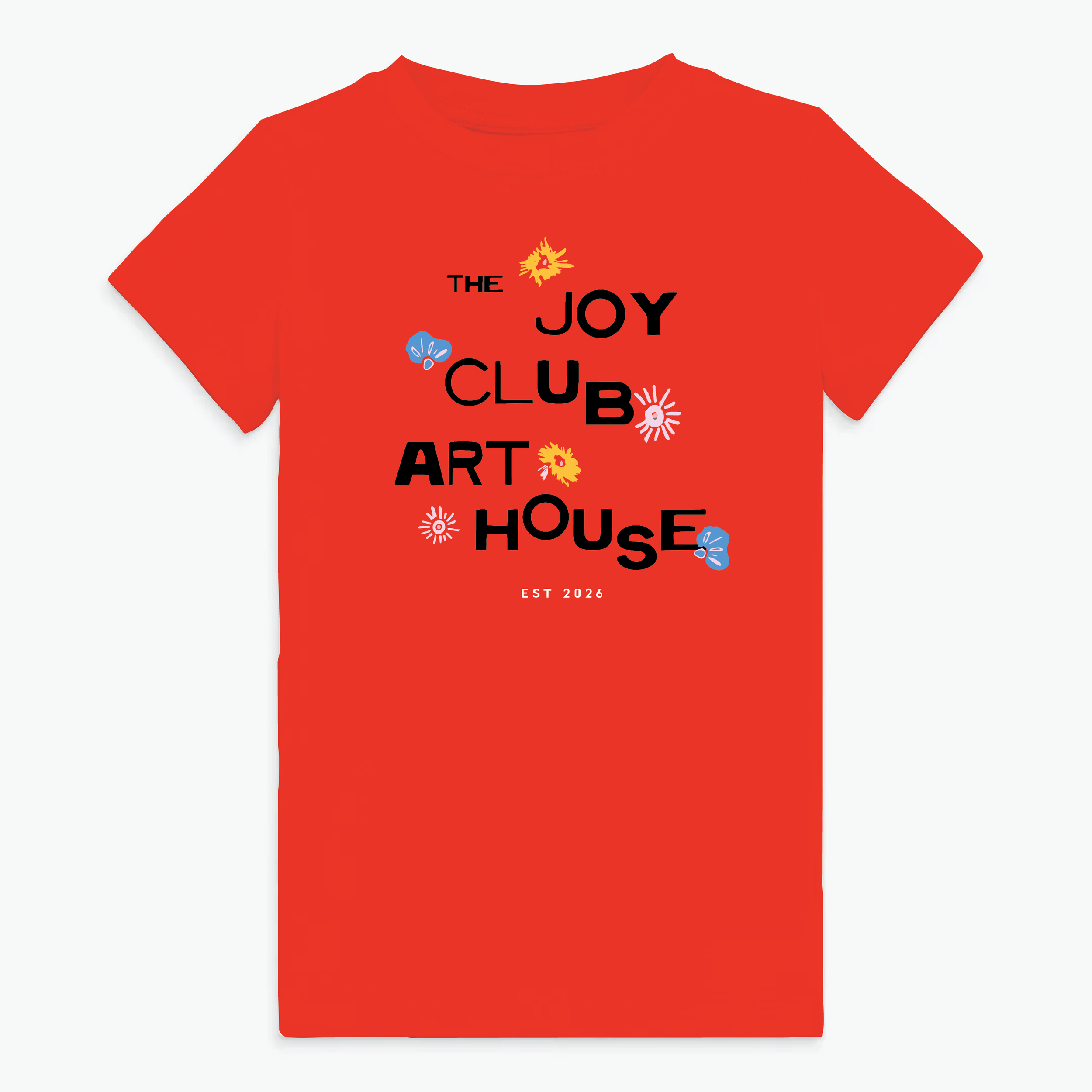
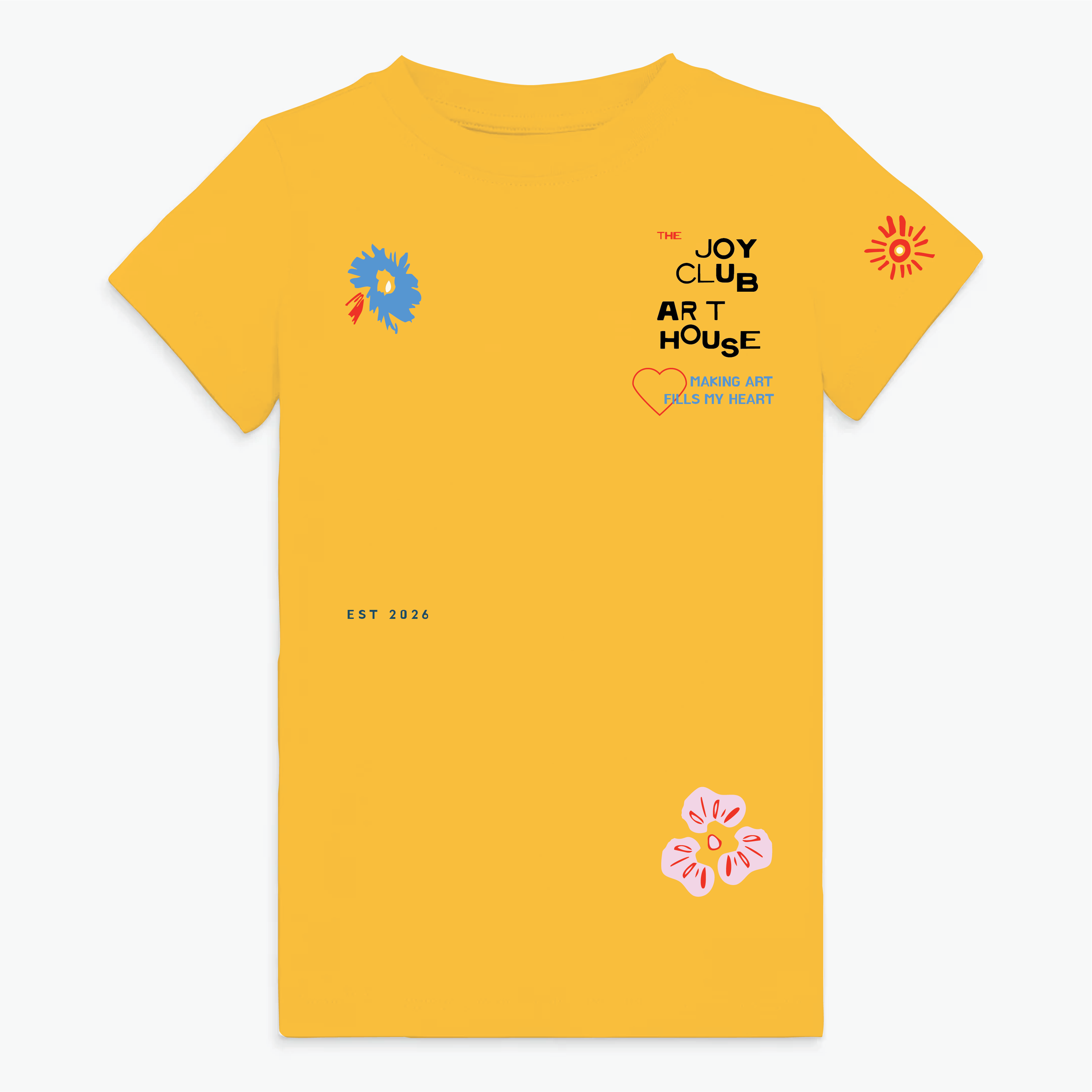
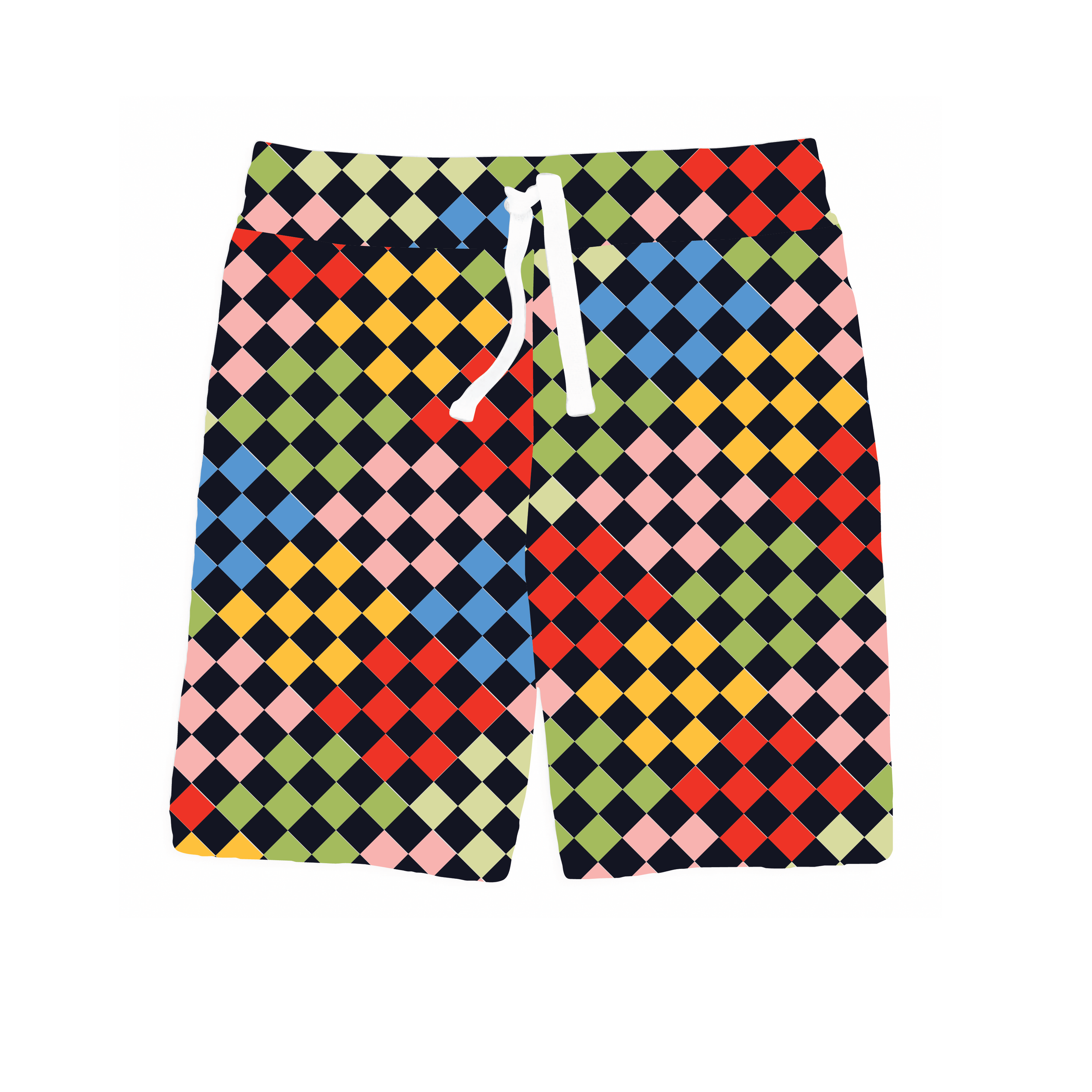
This portion of the capsule functions as the connective tissue between boys and girls—allowing siblings and peer groups to coordinate without rigid gender coding. Coordinating shorts work across the entire Joy Club capsule, reinforcing the modular nature of the assortment.
Design Notes:
• Abstract mark-making
• Typography-driven graphics
• Retro-inspired color blocking
• Gender-fluid palette
• Mixable bottoms across themes
Lifestyle Expansion
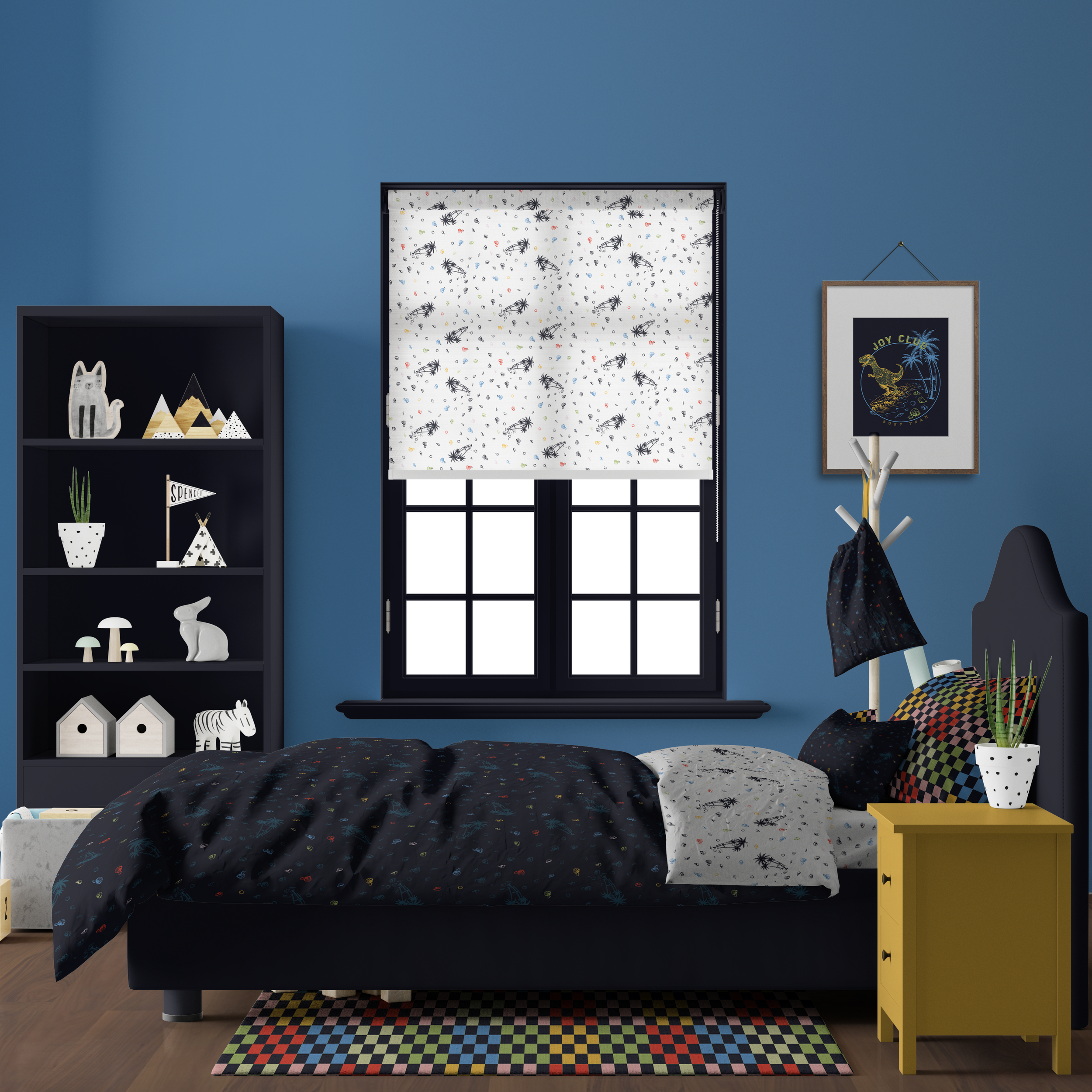
The boys’ bedding assortment evolves the Surfing Dinosaur concept into a playful bedroom environment. Character graphics and coastal motifs appear alongside tonal wave textures and surf-inspired iconography. Pattern scale shifts from bold statement placements to smaller repeats, allowing the bedding set to balance energy with visual clarity.
Stationery items extend the art club narrative. Simplified illustrations and coastal references maintain the adventurous tone of the apparel capsule while adapting comfortably to notebooks, sketch pads, and desk accessories.
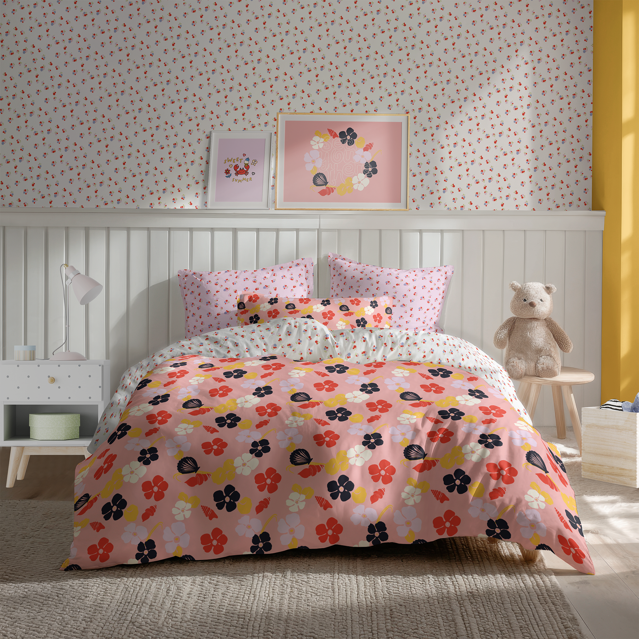
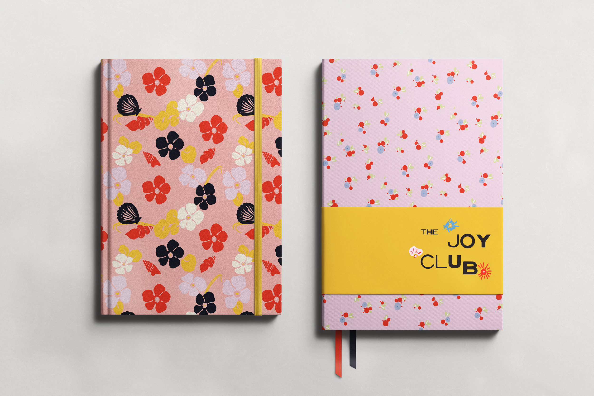
The girls’ bedding assortment extends the Coastal Bloom narrative into a bedroom environment. Painterly florals are translated into layered textile scales—expressive hero motifs for duvet covers, softer repeats for sheets and shams, and delicate tossed florals for accent pieces. The result is a calm, expressive space where sea imagery reinforces the capsule’s themes of creativity and warmth.
Stationery pieces translate the same floral language into smaller-scale formats suited for journaling, notes, and personal expression. Soft watercolor motifs and scattered ocean elements maintain the collection’s gentle atmosphere while allowing each piece to function as a standalone object within the broader lifestyle system.
Cross-Capsule Coordination