Coach Print Graphic & Technique Development
Placement & All-Over Prints
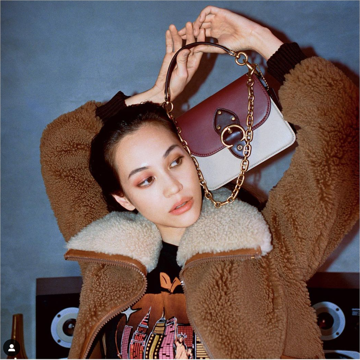
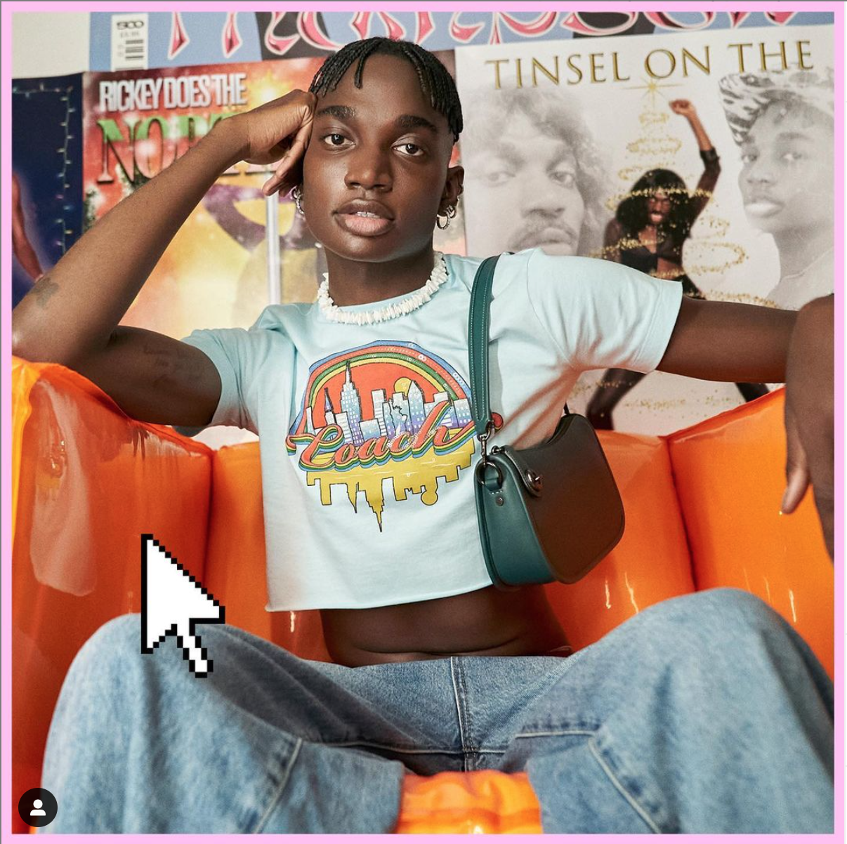
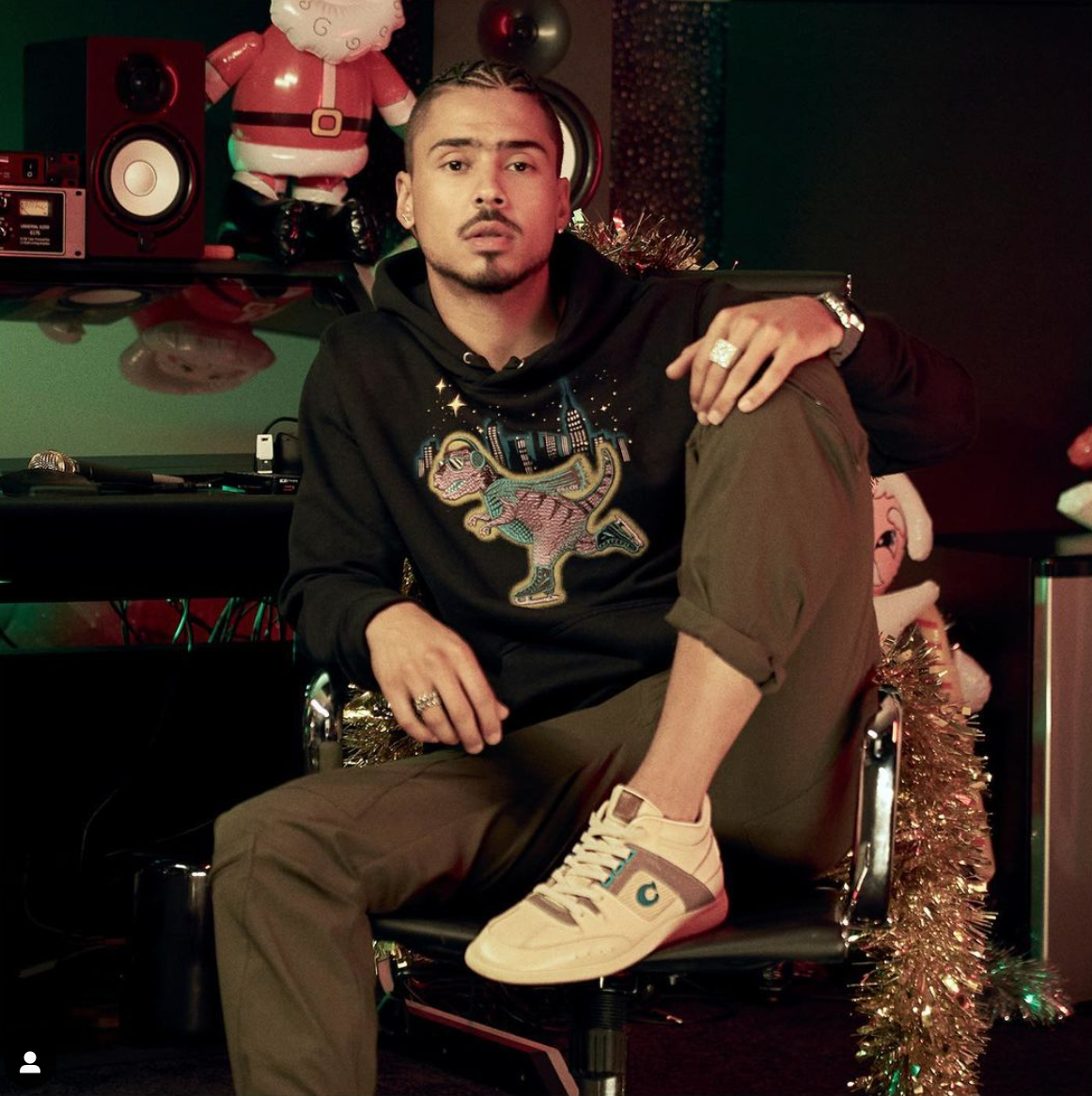
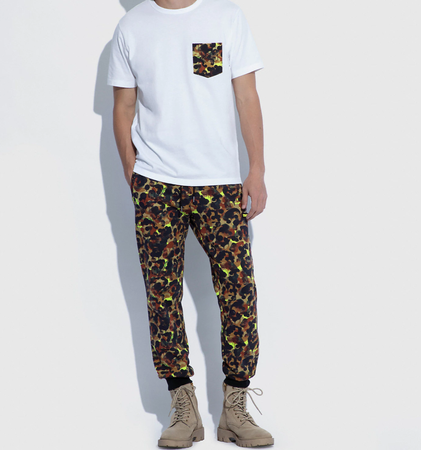
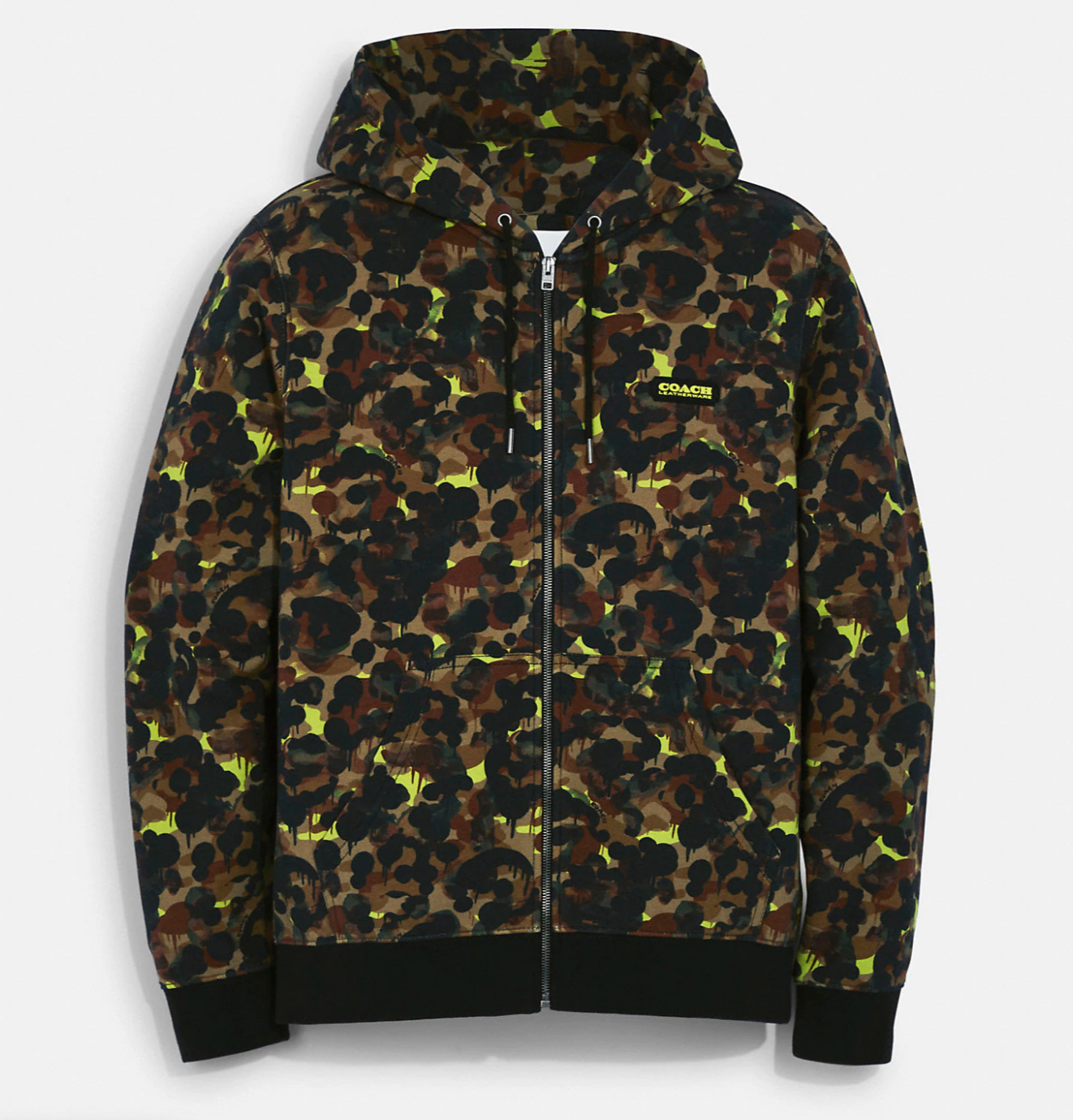
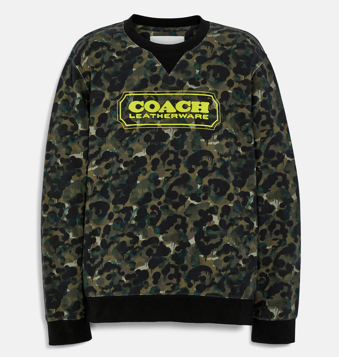
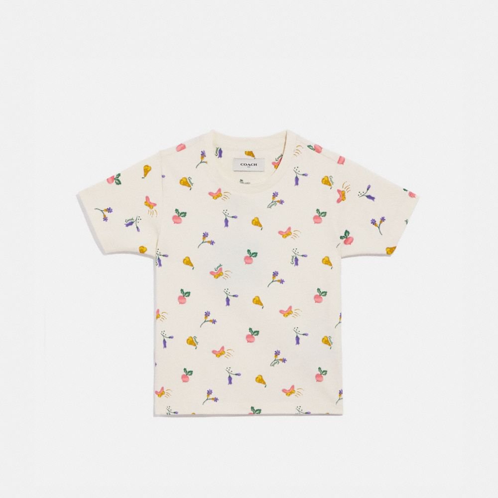
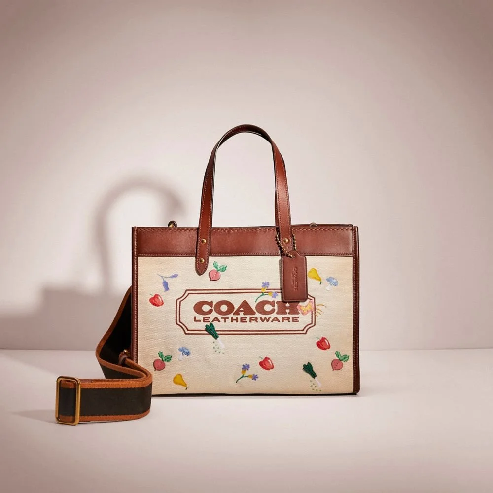
Led graphic execution and adaptation of Coach brand codes within youth assortments, translating heritage iconography into scalable, production-ready applications across apparel and outerwear.
This work required careful balance between playful expression and brand integrity — ensuring logos, wordmarks, and seasonal storytelling remained aligned with luxury positioning while adapting proportion, color, and technique for youth markets.
Design &
Technical Scope
• Screen print and engineered repeat development
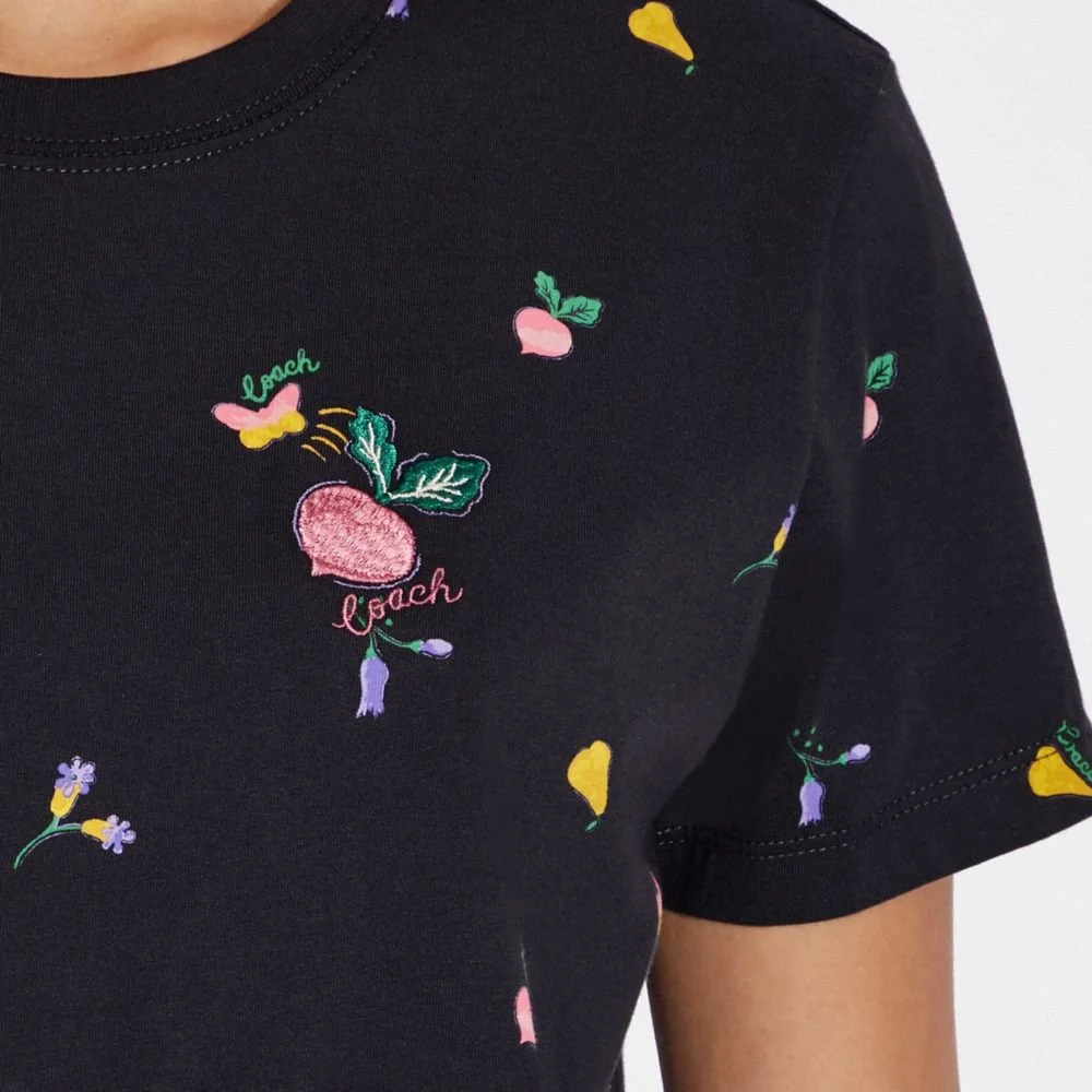
• Embroidery and appliqué execution
• Mixed-media embellishment
• Logo reinterpretation within seasonal narratives
• Scalable placement across extended size ranges
Graphics were engineered to maintain clarity and impact across youth silhouettes while respecting factory capabilities and cost parameters.
Brand Code Integration
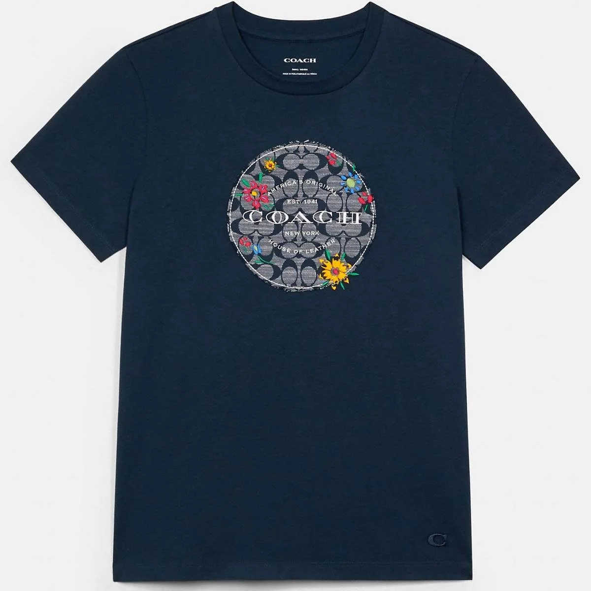
Heritage elements — including wordmarks, signature motifs, and archival references — were reimagined through:
• dimensional embroidery
• layered appliqué
• tonal and color-blocked treatments
• engineered repeat adaptations
Each execution preserved logo recognition while offering freshness appropriate for youth assortments.
Production Alignment
Artwork was developed with close attention to:
• stitch count and embroidery density
• ink coverage and hand feel
• size grading adjustments
• embellishment durability
• factory feasibility and cost control

Outcome
The result was a youth assortment that upheld Coach’s premium standards while remaining commercially viable.